The Long-Term Decline of the U.S. Job Ladder | Niklas Engbom, Aniket Baksy, Daniele Caratelli
- [?] •workfutures.io +employer concentration: The Long-Term Decline of the U.S. Job Ladder | Niklas Engbom, Aniket Baksy, Daniele Caratelli
'We quantify how structural changes in the U.S. labor market have contributed to wage stagnation over the past four decades by weakening the job ladder.' 'We estimate that employed workers today are about half as likely to receive a better-paying outside offer as they were in the 1980s.' 'Cross-state variation suggests that rising employer concentration and the growing use of noncompete agreements have curtailed opportunities for job shopping.' #must #investigate
body
March 2026
Abstract
We quantify how structural changes in the U.S. labor market have contributed to wage stagnation over the past four decades by weakening the job ladder. Using Current Population Survey microdata from 1982–2023 and a partial-equilibrium job-ladder model, we estimate that employed workers today are about half as likely to receive a better-paying outside offer as they were in the 1980s. This decline is unlikely to reflect less efficient matching, weaker labor demand, or changes in workers’ acceptance behavior. Instead, cross-state variation suggests that rising employer concentration and the growing use of noncompete agreements have curtailed opportunities for job shopping. In general equilibrium, we find that these structural changes have reduced annual real wage growth by 0.68 percentage points—roughly one-third of the post-1980 slowdown—with about two-thirds of the effect operating through equilibrium wage setting rather than mechanical reallocation.
*We thank participants at numerous conferences and seminars for helpful comments and feedback. We are particularly grateful to Alex Clymo, Jason Faberman, Kerstin Holzheu, Guillaume Nevo and Laura Pilossoph for insightful discussions, as well as Paolo Martellini, Guido Menzio, Giuseppe Moscarini, Richard Rogerson, Venky Venkateswaran, Gianluca Violante and participants at numerous conferences and seminars for helpful comments and feedback. †Corresponding author: ne466@nyu.edu
Page 2
1 Introduction
Wage growth in the United States has been historically weak since the early 1980s. After more than doubling between 1940 and 1970, real hourly earnings have increased by only about 25 percent since 1980, despite continued productivity growth (see Figure 1). Moreover, much of this modest increase reflects compositional shifts toward older and more educated workers, who tend to earn higher wages. Holding demographics fixed at their early-1980s levels, real wage growth since then is close to zero. [1]
Figure 1: Real Hourly Earnings in the United States, 1939–2023
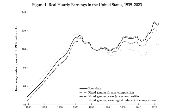
Notes: Wage and salary income last year divided by the product of weeks worked last year and hours worked last week, deflated using the Urban Consumer Price Index (CPI-U), and winsorized at $2.13 in 2022 real hourly wages. Hours worked last week are intervalled between 1960–1976; weeks last year are intervalled in 1960. “Fixed demographics” adjusts the provided survey weights to hold constant demographic composition in 1982 along various dimensions. The sample includes wage-employees aged 20–59 who were at work last week and had positive wage and salary income last year. See Appendix A for details. Source: U.S. Decennial Census 1939–1959; CPS ASEC 1961–2023.
Why did wage growth slow so sharply? A large literature emphasizes skill-biased technical change (Acemoglu, 2002; Autor, 2015), trade exposure (Autor, Dorn and Hanson, 2013), declining unions (Farber et al., 2018), and the falling real value of the federal minimum wage (Lee, 1999; Card and DiNardo, 2002), among other factors. While these forces explain important shifts in the wage structure, they are largely silent on changes to the functioning of the U.S. labor market and their impact on worker reallocation across jobs.
Motivated by evidence that mobility toward higher-paying employers is a central source of wage growth (Topel and Ward, 1992; Haltiwanger, Hyatt and McEntarfer, 2018), we quantify how structural changes in the U.S. labor market have contributed to wage stagnation over the past four decades by weakening the job ladder. Using Current Population Survey (CPS) microdata from 1982–2023 and a partial-equilibrium job-ladder model, we estimate that employed workers today are about half as likely to receive a better-paying outside offer as they were in the 1980s. This decline is unlikely to reflect less efficient matching, weaker labor demand, or changes in workers’ job acceptance behavior. Instead, cross-state variation suggests that rising employer concentration and the growing use of noncompete agreements have curtailed opportunities for job shopping.[2] In general equilibrium, we find that these structural changes have reduced annual real wage growth by 0.68 percentage points—roughly one-third of the post-1980 slowdown—with about two-thirds of the effect operating through equilibrium wage setting rather than mechanical reallocation.
Our analysis proceeds in three parts. First, we propose a transparent measure of upward job mobility based on a canonical job-ladder model that can be implemented in repeated cross-sectional microdata. Specifically, we measure the strength of the job ladder using the gap between the wage distribution of all employed workers and that of workers newly hired from nonemployment (our proxy for the offer distribution). A larger gap reflects more frequent offers from higher-paying employers, which accelerates movement up the wage ladder (Mortensen, 2003; Jolivet, Postel-Vinay and Robin, 2006). Empirically, we adjust wages for rich observables and life-cycle effects, and nonparametrically estimate these two distributions in each period.
Consistent with the model, the wage distribution stochastically dominates the offer distribution in every period of our sample. Since the early 1980s, however, the wage-offer gap has narrowed substantially, implying a decline in upward job mobility. We estimate that the arrival rate of better-paying outside offers to employed workers fell by 51 percent between 1982–1991 and 2012–2021. We find little evidence that reduced mobility toward higher-paying jobs has been offset by greater mobility along non-wage dimensions. The decline is broad-based across gender, race, and education groups, and is especially pronounced among younger workers.
In the canonical model, the wage-offer gap reflects external mobility alone. While we control for wage growth with age, other forces that could contribute to this gap include wage growth with tenure (Altonji and Williams, 2005), selection on unobservables (Gregory, Menzio and Wiczer, 2021), and recall error and employment-status misclassification (Abowd and Zellner, 1985; Fujita and Moscarini, 2017). Allowing for these factors, we estimate modest and stable returns to tenure, suggesting that lower external mobility has not been offset by greater within-firm wage growth. Selection on unobservables and recall unemployment/status misclassification modestly affects inferred levels of upward mobility, but leaves the estimated change over time largely unchanged.
We further confront the model’s implications with longitudinal data from the 1979 and 1997 National Longitudinal Survey of Youth (NLSY79 and NLSY97). Consistent with the theory, workers in both cohorts experience excess wage growth relative to same-aged peers after a spell of nonemployment, and most of this excess growth is realized through subsequent job-to-job moves. Across cohorts, both the frequency of job-to-job mobility and the wage gains conditional on moving have declined. The model matches these additional (non-targeted) outcomes quantitatively well.
In the second part of the paper, we embed the model in general equilibrium via an aggregate matching function to discipline candidate explanations for the weakening of the job ladder. Job-finding rates from nonemployment and employment depend on the efficiency with which the labor market matches vacancies to searching workers, firms’ vacancy creation, and workers’ job acceptance behavior. We show that movements in aggregate matching efficiency, labor demand and workers’ job acceptance decisions scale job-finding from nonemployment and employment proportionally. In the data, however, job-finding from nonemployment has declined only modestly over the past 40 years, while job-finding from employment has fallen sharply. This divergence points to forces that have specifically reduced the efficiency of on-the-job search.
The literature has proposed several factors that could depress employed workers’ search for alternative jobs, including housing lock-in due to higher mortgage rates (Chan, 2001; Ferreira, Gyourko and Tracy, 2010) and dual-career constraints (Costa and Kahn, 2000). We assess these channels by estimating the model separately for homeowners versus renters and for single- versus dual-career households. Although all groups saw large declines, the fall is larger for renters and single households, suggesting that greater house lock or more acute dual-career concerns are unlikely to be primary drivers of the secular decline in the efficiency of on-the-job search.
We next turn to cross-state variation to shed light on the sources of the decline in the efficiency of on-the-job search. Guided by recent work, we focus on employer concentration (Bagga, 2023) and the prevalence of noncompete agreements (Gottfries and Jarosch, 2023). States with larger increases in concentration and states with higher noncompete prevalence exhibit larger declines in the efficiency of on-the-job search, consistent with these forces limiting workers’ ability to shop for better outside options. Quantitatively, the implied magnitudes are in line with, or somewhat conservative relative to, estimates in Berger et al. (2023) and Lipsitz and Starr (2022). Taken together, our estimates imply that rising concentration and noncompetes can account for roughly 60 percent of the national decline in the efficiency of on-the-job search between the 1980s and 2010s.[3]
In the third part of our analysis, we quantify the wage effects of the estimated changes in labor-market structure within the framework of Burdett and Mortensen (1998). Differentially productive firms post wages above workers’ reservation wages to attract and retain employees. A decline in the efficiency of on-the-job search affects posted wages through two channels. First, it leads potential hires to be worse matched and incumbent employees to be less likely to receive better outside offers, both of which put downward pressure on posted wages. Second, it alters the option value of accepting employment and therefore workers’ reservation wage. Holding firms’ pay policies fixed, lower efficiency of on-the-job search increases the forgone option value of search associated with accepting employment, raising the reservation wage. At the same time, as on-the-job search becomes less efficient, firms converge toward offering the reservation wage (Diamond, 1982), weakening workers’ incentives to wait for a better offer. Whether the reservation wage ultimately rises or falls with the efficiency of on-the-job search is therefore a quantitative question.
We then confront a calibrated version of the model with cross-state variation in labor-market structure and wages. We fix the remaining parameters using national-level moments, feed in estimated cross-state differences in labor-market structure, and contrast the predicted wage differences across states with those observed in the data. In the data, states with greater upward job mobility have higher wages conditional on observables (including three-digit occupation), which the model matches quantitatively well. While higher observed wages are partly mechanical when workers move up the job ladder more rapidly, we also show that offered wages are higher in high-mobility states, consistent with the model’s prediction that greater efficiency of on-the-job search intensifies competition for workers and induces firms to post higher wages. Moreover, the theory predicts that high-productivity, high-wage, large firms respond especially strongly to higher efficiency of on-the-job search—raising pay more when employed search is more efficient—a pattern for which we find support in the cross-state data.
Finally, we use the model to aggregate these effects to the national time trend. Across assumptions about preferences and about how the reservation wage adjusts, the observed changes in U.S. labor-market structure over the past four decades—and the associated decline of the U.S. job ladder—reduce the annual growth rate of composition-adjusted real wages by 0.19–0.71 percentage points, with our preferred specification implying a 0.68 percentage point decline. Given that composition-adjusted real wage growth was around two percent per year between the 1940s and 1970s and close to zero between the 1980s and 2010s, the decline in the efficiency of on-the-job search hence accounts for about one-third of the post-1980 slowdown in wage growth. Roughly one-third of this effect reflects the mechanical impact of reduced upward mobility holding fixed firms’ pay policies, while the remaining two-thirds arises because firms optimally reduce posted wages in equilibrium when they face effectively less competition for employees. This equilibrium channel is especially important for high-productivity, high-wage, large firms, so that the firm size–wage premium falls as in the data (Bloom et al., 2018).
We contribute in two ways to the literature documenting and interpreting the secular decline in U.S. business dynamism and worker reallocation over the past four decades (Hyatt and Spletzer, 2013; Davis and Haltiwanger, 2014; Molloy et al., 2016; Fujita, Moscarini and Postel-Vinay, 2024; Karahan, Pugsley and Şahin, 2024). First, we provide evidence on upward job mobility back to the early 1980s. By contrast, the widely used CPS-based evidence on job-to-job transitions begins with the 1994 CPS redesign (Fallick and Fleischman, 2004).² Second, we propose a
²Other data sources include the Survey of Income and Program Participation (SIPP) and the Longitudinal Employer-Household Dynamics (LEHD). Although the SIPP begins in 1984, major redesigns in 1996 and the shift to annual interviewing in 2014 complicate comparisons over time. The LEHD only achieves broad national coverage in the early 2000s; its quarterly frequency also makes it difficult to cleanly identify job-to-job transitions.[4] model-consistent measure of job mobility that isolates the component of job-to-job transitions directed toward higher-paying employers, rather than relying on the overall job-to-job transition rate. We show that a substantial share of job-to-job moves are not systematically upward in the wage distribution, so aggregate job-to-job mobility can be a noisy proxy for the wage-growth-relevant portion of ladder climbing. Although our focus on wage stagnation is different, our approach is closely related to Jolivet, Postel-Vinay and Robin (2006), who also emphasize that cross-sectional wage data are informative about underlying mobility patterns in canonical search models.
Our analysis also relates to a rapidly expanding literature on labor market power and its implications for wages, employment, and mobility (e.g., Azar et al., 2020; Prager and Schmitt, 2021; Azar, Marinescu and Steinbaum, 2022; Berger, Herkenhoff and Mongey, 2022; Benmelech, Bergman and Kim, 2022; Rinz, 2022; Autor, Dube and McGrew, 2023; Caldwell and Danieli, 2024). Most closely related, Bagga (2023) and Berger et al. (2023) document a robust negative relationship between employer concentration and job-to-job mobility, while Starr, Prescott and Bishara (2021), Lipsitz and Starr (2022) and Gottfries and Jarosch (2023) find that noncompete agreements reduce mobility. We complement these findings by linking concentration and noncompetes to declines in efficiency of on-the-job search in a job-ladder framework and by quantifying the implied general-equilibrium effects on wage growth.
The remainder of the paper is organized as follows. Section 2 introduces the baseline model. Section 3 presents the data and Section 4 our main findings. Section 5 investigates the causes of the decline in upward job mobility, while Section 6 quantifies its implications. Section 7 concludes.
2 A Canonical Partial Equilibrium Job Ladder Model
Our starting point is a canonical partial equilibrium job ladder model. In this section, we treat both the job finding rates and the wage offers as exogenous, and later endogenize both following Mortensen and Pissarides (1994) and Burdett and Mortensen (1998).
2.1 Setting
Time is continuous and the economy is in steady state.³ A unit mass of risk-neutral workers move across jobs and between employment and nonemployment. An employed worker’s log wage decomposes into observables X, age-based human capital
³ Allowing the nonemployment rate and wage distribution to vary over time adds time-derivative terms to (4)–(5) and requires two additional moments,
<page_number>6</page_number>
Page 7
The controls in
Nonemployed workers receive a job offer at rate
Let
Similarly, let
The stationary employment and nonemployment rates are $$ e(\infty) = \frac{p}{p + \delta}, \quad n(\infty) = \frac{\delta}{p + \delta}. \quad (4) $$
Employed workers receive two types of outside offers. First, at rate
Second, at rate
Let
Dividing by
<page_number>7</page_number>
Page 8
between two “reset” events that set her back in her quest to move up the wage ladder $$ \kappa \equiv \frac{\lambda^e}{\delta + \lambda^f}. $$ A higher net upward mobility rate
Let
2.2 Moment Conditions
The model has four parameters
Next, we estimate
<page_number>8</page_number>
Page 9
Finally, we recover
The share of workers initially earning wage
3 Data
Our primary data source is the CPS, a rotating panel in which households are interviewed for four consecutive months, out of sample for eight months, and then interviewed for four additional months. We refer to the first four months as months-in-sample (MIS) 1–4 and the second four months as MIS 5–8.
3.1 Variable Construction and Sample Selection
We link individuals using household and person identifiers, age, sex, and race. Changes in CPS identifiers prevent linking during June–July 1985, September–October 1985, and May–October 1995. Allocation flags became available in January 1982 and the Census Bureau altered the record-
<page_number>9</page_number>
Page 10
ing of weekly earnings beginning in April 2023,5 so we focus on January 1982 to March 2023.
Background characteristics. Every month, the CPS records labor force status, job-search activity for those not employed, demographics, and occupation; we refer to these Basic Monthly Surveys as BMS 1–4 and 13–16. There are two main challenges to obtaining a consistent data set. First, changes to the coding of variables over time require harmonization. Second, item nonresponse leads the BLS to impute values, and the prevalence and methods of imputation vary over time.
We topcode age at 75, which is the minimum topcode used over our sample. We recode age to the (hypothetical) age in MIS 1, regardless of whether the respondent actually participated. We restrict to individuals aged 20–59 at hypothetical CPS entry to focus on prime working-age workers and to avoid retirement-related transitions. We aggregate race into white and nonwhite, and we standardize race within individuals to nonwhite if it was ever reported. We aggregate education into five categories: less than high school, high school diploma, some college, a bachelor’s degree, and postgraduate education.6 Education is standardized to the highest level ever reported. We use a harmonized three-digit occupation coding aligned with the Census Bureau’s 2010 occupation classification. We drop individuals with invalid sex, race, age, or education, and we drop individuals with valid wages but missing occupation.
In each month, we classify labor force status as missing, nonemployed, or employed. Allocated employment status is treated as missing. Because the distinction between unemployment and nonparticipation is often blurred (Clark and Summers, 1979), we collapse them into a single nonemployment category. Weekly earnings are only reported for wage and salary workers, so we treat self-employment spells as missing employment status. The employed category includes private and public wage and salary employees. A hire from nonemployment is defined as an individual who is wage-employed in month
Because attrition is not random, we use survey weights, normalized to the respondent’s average weight over their time in the sample. Moreover, to avoid a mechanical effect of changes to the demographic composition of the workforce, most of our analysis adjusts the provided survey weights so as to hold the age–gender–race–education composition fixed at its 1982–1991 average.
Appendix B.1 discusses the implications of excluding allocated demographics and standardizing demographic variables, and Table B.6 reports summary statistics for the final sample.
Job stayer status. For all respondents who are in the CPS in March, the Annual Social and Economic Supplement (ASEC) collects retrospective information for the prior calendar year, including weeks worked and the number of employers. Allocated responses are treated as missing. We
5In January 2023, the Census Bureau began rounding weekly earnings to enhance confidentiality. These changes apply only to new cohorts entering from January 2023 onward. They first affect reported wages when the January 2023 cohort reaches ORG 4 in April 2023. To avoid a break in the wage series, we end the analysis in March 2023. 6Prior to 1992, the CPS reports the highest grade attended and whether it was completed. From 1992 onward, it asks directly for the highest level completed. We construct attainment prior to 1992 by accounting for grade completion.
<page_number>10</page_number>
Page 11
define a job stayer as someone who reports working at least 52 weeks with one employer only.7 To compute the stayer share in year
Measuring wage dynamics among stayers is complicated by timing. From the ORG, we obtain wage observations 12 months apart, but they do not generally overlap with a calendar year. From the second March Supplement, on the other hand, we know if a worker stayed with their employer during the previous calendar year. To illustrate, an individual entering in December of year
Wages. In the month before a respondent temporarily or permanently leaves the CPS—MIS 4 and MIS 8—wage and salary workers answer additional earnings and hours questions. We refer to these Outgoing Rotation Group (ORG) interviews as ORG 4 and ORG 16. Earnings are reported before taxes and deductions and include overtime, commissions, and tips. For multiple-job holders, earnings refer to the main job. Hourly workers report an hourly wage, while salaried workers report usual weekly earnings and usual weekly hours on the main job. Weekly earnings are topcoded at thresholds that vary over time,8 and usual weekly hours are topcoded at 99. We construct hourly wages as the reported hourly wage for hourly workers and as usual weekly earnings divided by usual weekly hours for salaried workers. We convert wages to December 2022 dollars using the seasonally adjusted monthly CPI for all urban consumers. We multiply topcoded wages by 1.5 and winsorize low real hourly wages at $2.13, following Autor, Dube and McGrew (2023).
Where imputation can be identified, we treat allocated earnings and usual weekly hours as missing. Imputation flags are unavailable from January 1994 to August 1995, so for these months we retain all observations. Imputation flags are miscoded between 1989 and 1993. For these years, we infer imputation by comparing edited and unedited values in the source data.
3.2 Non-parametric Estimates of the Wage and Offer Distributions
Since our focus is residual wage dynamics, we residualize wages with respect to race, gender, education, state, occupation, and survey-month, each flexibly interacted with CPS entry year
7We have also used thresholds of 49–52 weeks with similar results. 8Topcoding thresholds are $999 in 1982–1988, $1,923 in 1989–1997, and $2,884.61 from 1998 onward.
<page_number>11</page_number>
Page 12
In the benchmark, we use three-digit occupations. The time trends below are similar with one-digit occupation controls or with no occupation controls, although levels differ.
We drop individuals whose residual wage in ORG 4 or ORG 16 lies below or above the 0.5th and 99.5th percentile of the residual wage distribution, respectively.
Over the life cycle, wages likely grow through both job mobility and general human capital accumulation. Because age is correlated with place in the job ladder, it would be inappropriate to control for age in (12). Instead, one can show that a proper way to remove the contribution of general human capital accumulation
where
Finally, we create an equidistant grid for wages between the minimum and maximum residual wage (after truncating the bottom and top 0.5 percent as noted above). The wage distribution
3.3 A First Look at the Data Through the Lens of the Model
Before turning to changes in the U.S. job ladder over time, we assess the model’s fit in the pooled sample. Table 1 reports parameter estimates and targeted moments. Standard errors come from 1,000 bootstrap resamples of the CPS microdata that preserve the panel structure. We estimate monthly transition rates below conventional values from monthly CPS gross flows. Likely reasons include recall unemployment and employment-status misclassification, which inflate high-frequency transitions (Fujita and Moscarini, 2017; Abowd and Zellner, 1985). In extensions, unobserved heterogeneity also generates rapid churn for some workers alongside long spells for others. Because the baseline model abstracts from such features, we target annual transition rates.
Step 2 yields net upward mobility of
According to Step 3, 1.5 percent of employed workers per month receive an undirected outside offer that they accept regardless of its wage, while 1.9 percent receive a directed offer that they
<page_number>12</page_number>
Page 13
accept only if it pays more than the current job.
Table 1: Model Fit and Parameter Estimates Pooling All Years of Data
| Parameter estimates | Targeted moments |
|---|---|
| Data | Model |
| --- | --- |
| Step 1. Flows in and out of employment | |
| δ | p |
| 0.008 | 0.019 |
| (0.000) | (0.000) |
| Step 2. Net upward mobility | |
| κ | |
| 0.816 | |
| (0.015) | |
| Step 3. Undirected and directed mobility | |
| ν | λf |
| 0.153 | 0.015 |
| (0.006) | (0.000) |
Notes: Baseline estimates in Step 3 abstracts from the uneven spacing of separation events during a year to impose A(w) = 1 for all w. Standard errors (in parentheses) are bootstrap standard errors based on 1,000 resamples that preserve the CPS panel structure. Source: CPS ASEC, BMS and ORG, 1982–2021, and authors’ calculations.
Figure 2: Model Fit, Pooling All Years
(a) Wage and Offer Distributions (b) κ'(w) Relative to Mean
Figure 2: Model Fit, Pooling All Years. Panel (a) compares the offer distribution (hires from nonemployment) to the wage distribution in the data and model by decade. Panel (b) plots the restricted estimate κ'(w). Wage construction, trimming, and weighting follow Section 3.1. Shaded areas are bootstrap standard errors based on 1,000 resamples that preserve the CPS panel structure. Source: CPS BMS and ORG, 1982–2021, and authors’ calculations.
Notes: Panel (a) compares the offer distribution (hires from nonemployment) to the wage distribution in the data and model by decade. Panel (b) plots the restricted estimate κ'(w). Wage construction, trimming, and weighting follow Section 3.1. Shaded areas are bootstrap standard errors based on 1,000 resamples that preserve the CPS panel structure. Source: CPS BMS and ORG, 1982–2021, and authors’ calculations.
<page_number>13</page_number>
Page 14
4 The Long-Term Decline of the U.S. Job Ladder
We re-estimate the model by decade: 1982–1991, 1992–2001, 2002–2011, and 2012–2021. We then extend the framework and validate its implications using alternative datasets.
4.1 Baseline Results
Figure 3 compares the empirical and model-implied wage distributions by decade (the remaining targeted moments are matched exactly in Steps 1 and 3). The model matches the observed wage distribution closely in each decade, with some deterioration of fit over time (our extensions below improve on this). In every decade, the wage distribution first-order stochastically dominates the offer distribution, but the distance between the two has narrowed over time. Through the lens of a textbook job-ladder model, this narrowing indicates declining net upward job mobility.
Table 2 summarizes our results. We estimate a modest rise in the separation rate
Table 2: Parameter Estimates by Decade
| Step 1 | Step 2 | Step 3 | |
|---|---|---|---|
| --- | --- | --- | --- |
| 1980s | 0.007 | 0.020 | 1.083 |
| (0.000) | (0.000) | (0.023) | |
| 1990s | 0.007 | 0.020 | 0.842 |
| (0.000) | (0.000) | (0.027) | |
| 2000s | 0.008 | 0.018 | 0.753 |
| (0.000) | (0.000) | (0.030) | |
| 2010s | 0.008 | 0.018 | 0.528 |
| (0.000) | (0.000) | (0.036) |
Notes: Decades correspond to January 1982 to December 1991, January 1992 to December 2001, etc. Standard errors (in parentheses) are bootstrap standard errors based on 1,000 resamples that preserve the CPS panel structure. Source: CPS ASEC, BMS and ORG, 1982–2021, and authors’ calculations.
In our baseline analysis, we residualize wages using three-digit occupation controls to isolate within-occupation wage dynamics, which we believe the theory is meant to capture. However, trends are similar with one-digit occupation or without occupation controls.
Although changes in demographic composition do not drive our results, since we adjust the survey weights to hold the joint distribution of age, gender, race, and education fixed at its 1980s level, it is of interest to assess whether some groups experienced particularly pronounced changes.
<page_number>14</page_number>
Page 15
Figure 3: Wage and Offer Distributions by Decade
(a) 1980s (b) 1990s (c) 2000s (d) 2010s
Notes: The offer distribution is the distribution of wages among workers who were nonemployed in the previous month. Residual hourly wages controlling for gender, race, education, 3-digit occupation, state and month all flexibly interacted with year, and deflated by the average residual wage of a hire from nonemployment of the same age in the same year. The provided survey weights are adjusted to keep demographic composition along age-gender-race-education dimensions fixed in the 1980s. Shaded areas are bootstrap standard errors based on 1,000 resamples that preserve the CPS panel structure. Source: CPS BMS and ORG, 1982–2021, and authors’ calculations.
Table 3 reports net upward job mobility
⁹Appendix C.1 shows that for workers with at most
<page_number>15</page_number>
Page 16
Table 3: Net Upward Job Mobility by Subgroup
| Decade | Gender | Education | Race | Age |
|---|---|---|---|---|
| Men | Women | No college | College | White |
| --- | --- | --- | --- | --- |
| 1980s | 1.150 | 1.023 | 1.026 | 1.557 |
| (0.036) | (0.028) | (0.024) | (0.072) | |
| 1990s | 0.979 | 0.739 | 0.833 | 1.090 |
| (0.040) | (0.034) | (0.029) | (0.062) | |
| 2000s | 0.811 | 0.710 | 0.750 | 1.018 |
| (0.042) | (0.043) | (0.034) | (0.060) | |
| 2010s | 0.730 | 0.415 | 0.521 | 0.856 |
| (0.060) | (0.042) | (0.041) | (0.060) |
Notes: “College” denotes workers with a bachelor’s degree or higher. “Young” denotes workers aged 20–35; the estimates use the finite-career adjustment in Equation (13). The provided survey weights are adjusted to keep demographic composition along age-gender-race-education dimensions fixed in the 1980s. Sample selection and wage residualization follows Section 3. Standard errors (in parentheses) are bootstrap standard errors based on 1,000 resamples that preserve the CPS panel structure. Source: CPS BMS and ORG, 1982–2021, and authors’ calculations.
4.2 Robustness
The model interprets the fact that hires from nonemployment earn less than observationally similar workers of the same age as evidence of a job ladder that workers gradually reclimb after a spell of nonemployment. However, similar patterns could arise from wage growth with tenure, mismeasured employment status/recall unemployment, or unobserved heterogeneity. We now extend the model along these dimensions to verify the robustness of our findings.
On-the-job wage dynamics. We model the log wage on the job,
where
where the jump sizes
A convenient continuous-time specification is to characterize
<page_number>16</page_number>
Page 17
so that
Employment status misclassification/recall unemployment. A long literature argues that gross flows in the CPS are substantially inflated by employment status misclassification (Abowd and Zellner, 1985). Motivated by these observations, we assume that a fraction
Hence, employment status misclassification/recall unemployment affects the mapping between the observed and true offer distributions. In particular, if over time a larger share of those we classify as hires from nonemployment are actually recalls to the previous employer at the previous wage, the observed wage and offer distributions will converge
Permanent unobservable heterogeneity. Figure 4a plots the distribution of respondents over total months in nonemployment during the eight-month CPS panel. A large share of workers spend their entire eight months employed, suggesting a low separation rate. To be consistent with the overall fraction of nonemployed, this also requires a low job-finding rate. However, a fair number of workers are nonemployed for some but not all months, which is inconsistent with low job separation and finding rates. More broadly, the joint distribution of respondents over employment status during the eight-month CPS panel is difficult to reconcile with a homogeneous-worker model with geometric (memoryless) hazards. 10
Figure 4b plots the average residual wage in ORG 16 as a function of the residual wage in ORG 4 among workers who were nonemployed in at least one of BMS 13–15. According to the textbook job ladder, this relationship should be flat, since a job loss resets the wage. 11 The data, on the other hand, indicate that someone who earned more prior to a job loss tends to earn more in their next job (conditional on observables including 3-digit occupation).
10Although employment status misclassification/recall unemployment generates more short spells of nonemployment, it is not sufficiently strong to match the observed patterns. 11Employment status misclassification/recall unemployment implies an upward-sloping relationship, since some workers who are recorded as job losers return to their previous job at their previous wage. Yet on its own, this force is not sufficiently strong to fully account for this pattern.
<page_number>17</page_number>
Page 18
Figure 4: Evidence of Unobserved Heterogeneity
(a) Distribution over Total Months Nonemployed (b) Wages Before and After Job Loss
Notes: Panel (a) plots the distribution of total months spent nonemployed during the eight-month CPS panel. Panel (b) plots mean residual wages in ORG 16 against mean residual wages in ORG 4 for workers recorded as nonemployed in at least one of BMS months 13–15. Sample selection and wage residualization follows Section 3. Shaded areas are bootstrap standard errors based on 1,000 resamples that preserve the CPS panel structure. Source: CPS BMS and ORG, 1982–2021, and authors’ calculations.
Motivated by the patterns in Figure 4, we assume that there are two permanent worker types,
where
Estimation. The extended model features 12 parameters to estimate internally:
We estimate these parameters using Simulated Method of Moments. Specifically, for a given set of potential parameter values and the observed offer and wage distributions, we first recover the true aggregate offer distribution from (14). Figure 5a illustrates our inferred true offer distribution,
<page_number>18</page_number>
Page 19
which is shifted to the left of the observed distribution as some respondents who are recorded as a hire from nonemployment in fact return to their previous employer, either due to employment status misclassification or recall unemployment. Subsequently, again under some given parameter values, we recover the type-specific offer distributions from (15). Figure 5b plots the offer distributions of the two types. We feed these type-specific offer distributions into the model to find parameter values to match as well as a set of targets that we discuss further below.
Figure 5: Offer Distribution, Extended Model
Figure 5: Offer Distribution, Extended Model. The figure contains four panels: (a) True and Observed Offer Distributions, (b) Offer Distribution by Type, (c) Hires from Nonemployment and Employment, and (d) Offer Distribution by Employment Status. Each panel plots the share of offers against log wage. Panel (a) shows the observed offer distribution (solid line) and the true offer distribution (dashed line). Panel (b) shows the offer distribution for low type (solid line) and high type (dashed line). Panel (c) shows the distribution of wages for non-employed (solid line), employed (data) (dashed line), and employed (model) (dash-dot line). Panel (d) shows the offer distribution for non-employed (solid line) and employed (dashed line). Shaded areas represent bootstrap standard errors.
Notes: Panel (a) plots the observed offer distribution constructed from recorded hires from nonemployment and the model-implied offer distribution after adjusting for employment-status misclassification/recall unemployment as in (14). Panel (b) plots the estimated offer distributions for the two unobserved worker types. Panel (c) plots the distribution of wages of hires from nonemployment and from employment in the data and in the model. Panel (d) plots the model-implied offer distributions conditional on employment status. Sample selection and wage residualization follows Section 3. Shaded areas are bootstrap standard errors based on 1,000 resamples that preserve the CPS panel structure. Source: CPS ASEC, BMS and ORG, 1982-2021, and authors’ calculations.
One important assumption that we maintain throughout is that the nonemployed and employed face the same offer distribution. Although we cannot directly observe sampled wages of the employed in the CPS, since 1994 we can measure the initial wages of job-to-job switchers, which we can confront with the same outcome in the model. Figure 5c shows that the model
<page_number>19</page_number>
Page 20
matches well the observed distribution of initial wages of hires from employment.
Although we assume that employment status has no causal effect on the offer distribution, selection on unobservables implies that the employed appear to sample better offers. In particular, high-type workers who sample better offers are overrepresented in the pool of employed, so that the average employed worker samples better offers than the average nonemployed worker, as shown in Figure 5d. This pattern is consistent with evidence in Faberman et al. (2022).
Figure 6 plots some of the key additional targets that inform the parameters of the extended model (see Appendix C.2 for a full list of targets). For instance, the model matches well the declining separation rate with the initial wage due to unobserved types with a high separation rate being concentrated at low wages (panel (a)), as well as the share of job stayers by the initial wage (panel (b)). In contrast, a model with only directed mobility would generate a stayer share that rises much too steeply with the initial wage. The extended model further improves on the stylized model’s fit of the empirical wage distribution (panel (c)). Finally, it matches well year-on-year wage changes of job stayers, job losers and all workers (panel (d)).
Results. Table 4 reports parameter estimates by decade (Appendix C.2 shows that the extended model fits very well the observed wage distribution in each decade). Accounting for employment status misclassification/recall unemployment increases the inferred gap between true offers and observed wages, which raises estimated net upward job mobility relative to the baseline model. Across decades, we continue to find small movements in
Since 1994, the CPS allows us to construct an aggregate job-to-job transition rate (adjusted as in Fujita, Moscarini and Postel-Vinay (2024)). Figure 7a plots this series and the model counterpart. Although the model is estimated on different moments, it matches both the level and the modest decline in job-to-job mobility well. The model reconciles this modest decline with a large fall in net upward job mobility because (i) many realized transitions are undirected, (ii) undirected mobility rises modestly, and (iii) as directed offers become rarer, acceptance rates rise as workers become more poorly matched.
The rest of Figure 7 provides corroborating evidence of the decline of the U.S. job ladder. Job losers experience smaller wage losses in recent decades (Figure 7b), consistent with a flatter ladder. The share of job stayers rises over time (Figure 7c). In principle, this could be due to a fall in
<page_number>20</page_number>
Page 21
Figure 6: Model Outcomes in the Extended Model Pooling All Years of Data
(a) Annual EN Rate by Wage (b) Annual Share of Job Stayers (c) Wage Distribution (d) Year-on-Year Wage Changes
A figure with four subplots. (a) Annual EN Rate by Wage: A line graph showing the share of nonemployed workers (y-axis, 0 to 0.2) by wage percentile (x-axis, 0 to 100). The solid line represents 'Data' and the dashed line represents 'Model'. Both lines start high at low percentiles and decrease, leveling off around 0.05-0.06 for higher percentiles. (b) Annual Share of Job Stayers: A line graph showing the share of job stayers (y-axis, 0.4 to 1) by wage percentile (x-axis, 0 to 100). The solid line represents 'Data' and the dashed line represents 'Model'. Both lines start around 0.7 and increase slightly to around 0.85. (c) Wage Distribution: A line graph showing the share of workers (y-axis, 0 to 0.12) by log wage (x-axis, -1.5 to 1.5). The solid line represents 'Data' and the dashed line represents 'Model'. Both lines form a bell curve centered around 0. (d) Year-on-Year Wage Changes: A line graph showing the share of workers (y-axis, 0 to 0.16) by wage change (x-axis, -1.5 to 1.5). The legend indicates 'All, data' (solid black), 'Stayers, data' (dashed black), 'Losers, data' (dotted black), 'All, model' (solid blue), 'Stayers, model' (dashed blue), and 'Losers, model' (dotted red). The 'All, data' and 'All, model' lines are bell curves centered around 0. The 'Stayers, data' and 'Stayers, model' lines are slightly higher and narrower. The 'Losers, data' and 'Losers, model' lines are lower and wider.
Notes: Panel (a) plots the share of workers who are nonemployed in month
4.3 Direct Evidence of a Decline in Upward Job Mobility
Our analysis so far infers a decline in upward job mobility from the model and primarily cross-sectional wage data. We now test these implications using longitudinal wage and employment dynamics in the NLSY. Specifically, we use the NLSY79 and NLSY97 cohorts, which entered the U.S. labor market in the early 1980s and early 2000s. We restrict to 1978–2022 and workers aged 22–38 after completing schooling, and reweight observations so the age-gender-race-education composition in the 1997 survey matches that in 1979. We convert hourly wages to real terms, winsorize at $2.13 (2022 dollars), remove person fixed effects, deflate residual wages by the mean
<page_number>21</page_number>
Page 22
Table 4: Parameter Estimates by Decade in Extended Model
| Parameter | Explanation | 1980s | 1990s | 2000s | 2010s |
|---|---|---|---|---|---|
| Job finding rate of nonemployed | 0.019 (0.000) | 0.021 (0.000) | 0.018 (0.000) | 0.018 (0.001) | |
| Separation rate of low type | 0.013 (0.001) | 0.011 (0.001) | 0.014 (0.002) | 0.015 (0.006) | |
| Separation rate of high type | 0.004 (0.000) | 0.004 (0.000) | 0.004 (0.001) | 0.004 (0.001) | |
| Share of low type | 0.410 (0.034) | 0.425 (0.051) | 0.424 (0.066) | 0.433 (0.117) | |
| Net upward mobility rate | 1.651 (0.176) | 1.300 (0.208) | 0.518 (0.147) | 0.899 (0.197) | |
| Undirected mobility rate | 0.012 (0.001) | 0.014 (0.001) | 0.016 (0.001) | 0.014 (0.002) | |
| Wage growth on-the-job | 0.012 (0.030) | 0.011 (0.026) | 0.004 (0.025) | -0.046 (0.034) | |
| Autocorrelation of wages on the-job | 0.028 (0.001) | 0.037 (0.002) | 0.041 (0.003) | 0.039 (0.003) | |
| Frequency of wage shocks | 0.114 (0.011) | 0.121 (0.018) | 0.166 (0.034) | 0.126 (0.031) | |
| Shape of wage shocks | 1.734 (0.076) | 1.560 (0.101) | 1.743 (0.166) | 1.458 (0.166) | |
| Mean difference in offer distributions | 0.307 (0.013) | 0.304 (0.016) | 0.293 (0.019) | 0.275 (0.034) | |
| Employment status misclassification | 0.003 (0.000) | 0.003 (0.000) | 0.002 (0.000) | 0.003 (0.001) |
Notes: Decades refer to January 1982 to December 1991, etc. The provided survey weights are adjusted to keep demographic composition along age-gender-race-education dimensions fixed in the 1980s. Parameters are estimated by simulated method of moments targeting 14,427 moments. Sample selection and wage residualization follows Section 3. Standard errors (in parentheses) are bootstrap standard errors based on 1,000 resamples that preserve the CPS panel structure. Source: CPS ASEC, BMS and ORG, 1982–2021, and authors’ calculations.
residual wage of same-age hires from nonemployment, and bin wages onto the model wage grid.
We identify spells that begin with a hire from nonemployment and track respondents for up to 120 months, allowing for subsequent nonemployment and reemployment. When a respondent experiences multiple such spells, we treat each spell separately. We compute wage profiles and event rates as a function of months since the hire and replicate these objects in the model.
Figure 8 plots residual wage growth following a hire from nonemployment, relative to same-age peers. For the earlier cohort, excess wage growth over the first 10 years is about 13 log points; it is smaller for the later cohort. The model matches both profiles closely, though it slightly understates the decline in excess wage growth across cohorts.
<page_number>22</page_number>
Page 23
Figure 7: Supporting Evidence from the CPS
(a) Job-to-Job Mobility (b) Average Wage Change of Job Losers (c) Share of Job Stayers, Early and Late Decade (d) EN Rate by Wage, Early and Late Decade
Notes: Panel (a) plots the aggregate job-to-job mobility rate; the data series is adjusted following Fujita, Moscarini and Postel-Vinay, 2024. Panel (b) plots the average year-on-year change in residual wages among workers who were nonemployed in at least one of BMS 13-15. Panels (c) plots the share of workers who remained with the same employer during the previous calendar year by their percentile of the residual wage distribution in their first ORG month. Panel (d) plot the share of workers who are nonemployed in month
In principle, excess wage growth after nonemployment could reflect within-employer progression (e.g., returns to tenure) or gains associated with job-to-job transitions. Table 5 shows that, in both the data and the model, mover gains account for most of the excess growth: stayer wage changes are near zero, whereas movers experience sizable gains. Both the mover share and the conditional gain from moving decline across cohorts. The model attributes this shift to a higher share of undirected moves, which are on average associated with wage losses.
14The definition of the job-to-job transition rate in Table 5 differs slightly from that in Figure 7a: the former is the share of workers employed in either month
<page_number>23</page_number>
Page 24
Figure 8: Wage Growth After a Spell of Nonemployment
(a) Data (b) Model
Relative residual wage 0.2 1980s-1990s 2000s-2010s 0.15 0.1 0.05 0 20 40 60 80 100 120 Months since hire from non-employment Relative residual wage 0.2 1980s-1990s 2000s-2010s 0.15 0.1 0.05 0 20 40 60 80 100 120 Months since hire from non-employment
Notes: Figure 8 plots the average residual log wage of workers who are hired from nonemployment in month
5 The Causes of the Decline of the U.S. Job Ladder
Our partial equilibrium analysis uncovers a large decline in upward job mobility in the U.S. over the past 40 years, but it is silent on its causes. This section analyzes what caused the decline.
5.1 Declining Efficiency of On-the-Job Search
Benchmark equilibrium models point to several mechanisms that can reduce upward job mobility, including lower aggregate matching efficiency, weaker labor demand, and changes to workers’ acceptance behavior. To analyze the role of these factors, suppose the offer-arrival rate,
Suppose furthermore that nonemployed workers accept only offers paying at least
<page_number>24</page_number>
Page 25
Table 5: NLSY Wage Outcomes: Model vs. Data
| 1980s–1990s | 2000s–2010s | Change | |
|---|---|---|---|
| Model | Data | Model | |
| --- | --- | --- | --- |
| 0.074 | 0.109 | 0.047 | |
| (0.002) | (0.010) | (0.004) | |
| -0.002 | -0.000 | -0.002 | |
| (0.000) | (0.000) | (0.001) | |
| 0.135 | 0.099 | 0.108 | |
| (0.015) | (0.005) | (0.020) | |
| Share movers | 0.020 | 0.022 | 0.019 |
| (0.000) | (0.000) | (0.001) |
Notes:
where
Our estimation identifies the realized rates
Equations (16)–(18) imply that changes in matching efficiency (
5.2 House Lock and Dual Career Considerations
The literature has identified several factors that could reduce the efficiency of on-the-job search. For instance, when interest rates rise, homeowners may be unwilling to move because a new mortgage would carry a higher rate (Chan, 2001; Ferreira, Gyourko and Tracy, 2010). Alternatively, mobility may be more difficult for dual-career households (Costa and Kahn, 2000).15 If
15A third possibility is that difficulty obtaining health insurance among those with pre-existing conditions limits mobility (Madrian, 1994; Gruber and Madrian, 2002). Although the ASEC contains data on employer-sponsored health
<page_number>25</page_number>
Page 26
these forces have become more acute over time or the share of workers with a mortgage or in dual career households has risen, it may account for the declining efficiency of on-the-job search.
To assess the potential role of these factors, we re-estimate the model separately for home-owners versus renters and for single- versus dual-career households. To analyze the role of home ownership, we use information from the ASEC, which restricts the analysis to the one-third of the CPS sample interviewed in March. We code someone as a homeowner if they ever lived in a dwelling owned by their household during their 16 months in the CPS. A renter is someone who never lived in a dwelling owned by their household during their appearance in the CPS. Using links that allow linking a respondent to their family members in the CPS, we code someone as being in a dual-career household if their spouse at any point during their 16 month appearance in the CPS usually worked 35 hours or more per week; everyone else is a single-career household.
Table 6 summarizes the efficiency of on-the-job search,
5.3 Employer Concentration and Noncompete Agreements
Two other recently highlighted factors that could reduce the efficiency of on-the-job search are rising employer concentration (Bagga, 2023; Berger et al., 2023) and the growing use of non-compete agreements (Lipsitz and Starr, 2022; Gottfries and Jarosch, 2023). Higher concentration limits opportunities for job shopping, while non-competes directly restrict mobility of the employed. We provide new evidence on the impact of these forces based on variation across U.S. states over time.
We first obtain
insurance, the CPS lacks historical information on medical expenses that could be used to infer pre-existing conditions. We therefore cannot analyze this hypothesis.
<page_number>26</page_number>
Page 27
Table 6: Efficiency of On-the-Job Search by Subgroup
| Panel A. House lock | All ages | Young | Non-college |
|---|---|---|---|
| Pooled sample | Renter | Owner | |
| --- | --- | --- | --- |
| Level (1980s) | 1.268 | 1.133 | 1.324 |
| (0.027) | (0.020) | (0.010) | |
| % change (1980s–2010s) | -44.7 | -70.0 | -42.2 |
| (4.1) | (2.6) | (1.6) | |
| Panel B. Dual career lock | All ages | Young | Non-college |
| Pooled sample | Single | Dual | |
| Level (1980s) | 1.268 | 1.211 | 1.308 |
| (0.027) | (0.008) | (0.010) | |
| % change (1980s–2010s) | -44.7 | -53.8 | -34.4 |
| (4.1) | (1.0) | (2.0) |
Notes: “Non-college” denotes workers with less than a bachelor’s degree. “Young” denotes workers aged 20–35; the estimates use the finite-career adjustment in Equation (13). Owners are those who live in a household that owns their home; renters are those who live in a rented home. Dual career households are those whose spouse usually works 35 hours or more a week; everyone else is a single. The provided survey weights are adjusted to keep demographic composition along age-gender-race-education dimensions fixed in the 1980s. Sample selection and wage residualization follows Section 3. Standard errors (in parentheses) are bootstrap standard errors based on 1,000 resamples that preserve the CPS panel structure. Source: CPS BMS and ORG, 1982–2021, and authors’ calculations.
of establishments with 100+ employees or log average establishment size. We project the change in outcome
Unfortunately, historical time series on non-compete agreements are unavailable, so we use contemporaneous non-compete prevalence as a proxy for the change in their use and enforcement between the 1980s and 2010s. We motivate this proxy with the view of legal experts that “decades ago, non-compete agreements were widely regarded with suspicion and limited to only a handful of high-ranking employees within a given company. That began changing in the 1980s and picked up steam over the next couple decades. The era from 1990 through circa 2010 was the Golden Age of non-compete enforcement in America. Big firm corporate lawyers built entire practices dedicated to non-compete enforcement.”¹⁷ To the extent that contemporaneous prevalence is an noisy proxy for the change, we would expect any estimated relationships to be attenuated.
Table 7 shows that states with larger increases in concentration—and states with higher non-compete prevalence—experienced larger declines in net upward mobility,
¹⁷ Pollard PLLC, “Franchise Non-Compete Agreements: Mostly Unenforceable as Written,” July 6, 2018, https://pollardllc.com/franchise-non-compete-agreements/ (accessed February 19, 2026).
<page_number>27</page_number>
Page 28
separations
Table 7: Cross-State Evidence on Employer Concentration and Non-Compete Agreements
| Panel A. Employment share of 100+ establishments, 1980–2010 change | ||||
| Employment share of 100+ estab. | -2.207** (1.073) |
-0.061*** (0.023) |
0.017*** (0.006) |
-3.031*** (1.170) |
| Share of workers with non-compete | -1.776* (0.976) |
-0.032 (0.021) |
0.007 (0.006) |
-1.809* (1.064) |
| Panel B. Log average establishment size, 1980–2010 change | ||||
| Log average establishment size | -0.814* (0.484) |
-0.022** (0.010) |
0.005* (0.003) |
-1.200** (0.528) |
| Share of workers with non-compete | -1.787* (0.990) |
-0.032 (0.021) |
0.007 (0.006) |
-1.830* (1.081) |
| Panel C. Employment share of 100+ establishments, state-decade panel | ||||
| Employment share of 100+ estab. | -1.908** (0.907) |
-0.055*** (0.020) |
0.015** (0.007) |
-2.817*** (0.967) |
| Panel D. Log average establishment size, state-decade panel | ||||
| Log average establishment size | -0.723** (0.353) |
-0.019*** (0.007) |
0.005 (0.003) |
-1.080*** (0.366) |
Notes: The unit of observation is a U.S. state. Flow parameters are estimated separately by state and decade using the procedure described in the main text. The employment share of 100+ estab. is the employment share of establishments with 100 or more employees. Non-compete coverage is the share of workers reporting being bound by a non-compete agreement. In Panels A–B, the dependent variables are within-state changes in the corresponding flow parameter between the 1980s and 2010s; regressors are the within-state change in the indicated concentration measure and the contemporaneous non-compete share. Panels C–D use a state-decade panel with state and decade fixed effects and include only the concentration measure. Panels C–D cluster standard errors at the state level. Standard errors do not account for sampling uncertainty in the first-stage estimation of flow parameters. Source: CPS ASEC, BMS, and ORG, 1982–2021; BDS, 1982–2021; the SHED, 2022–2024; and authors’ calculations.
In terms of magnitudes, the estimates in Panel A imply that a one percentage point increase in the employment share of establishments with 100+ employees is associated with a 0.061 percentage point decline in the monthly arrival rate of directed outside offers,
<page_number>28</page_number>
Page 29
increase in employer concentration (measured by the Herfindahl index) is associated with a 10 percent fall in the job-to-job mobility rate across local labor markets in Norway.
As for non-competes, Lipsitz and Starr (2022) estimate that a 2008 ban on non-competes for hourly and low-wage workers in Oregon raised job-to-job mobility by 12–18 percent. Prior to the reform, 14 percent of such workers were bound by a non-compete, close to the 12 percent unweighted average across states in our sample. If we interpret a ban as reducing non-compete coverage from 12 percent to zero, our estimates imply an increase of
A simple back-of-the-envelope calculation helps put these estimates in perspective. Log average establishment size increased by about 0.08 nationally between the 1980s and 2010s, while 13 percent of workers report being covered by a non-compete agreement in 2022–2024. Combining these changes with the estimates in Table 7 implies a decline in employed-search efficiency of
corresponding to roughly 63 percent of the estimated fall in
6 The Aggregate Consequences of the Decline of the U.S. Job Ladder
In this section, we return to our original motivation: quantifying the role of changes to the structure of the U.S. labor market toward wage stagnation over the past 40 years.
6.1 Endogenizing the Offer Distribution
To translate the estimated decline in efficiency of on-the-job search into aggregate wage dynamics, we now microfound the offer distribution following the seminal work of Burdett and Mortensen
<page_number>29</page_number>
Page 30
(1998). The economy has a unit mass of homogeneous workers and a mass
Workers' problem. A standard argument implies that nonemployed workers follow a reservation rule, accepting only offers paying
Firms' problem. Firms differ in productivity
Efficiency pay. To see why the data require
<page_number>30</page_number>
Page 31
With
Recovering the remaining general equilibrium parameters. Given estimates of
First, we determine the threshold
Three issues matter for counterfactuals. First, we only identify
18In practice, for numerical stability we impose
<page_number>31</page_number>
Page 32
constraint. Because our estimates imply that the reservation wage tends to rise when
Second, we do not recover the underlying productivity distribution below
Third, we can infer the flow value of nonemployment
6.2 The Impact of Lower Efficiency of On-the-Job Search in Theory
Let
subject to
Differentiating this verifies the assumption that
Finally, using the fact that
The competition channel. A change in efficiency of on-the-job search affects pay through two channels. Differentiating (27), holding
where
<page_number>32</page_number>
Page 33
The reservation channel. A change in the efficiency of on-the-job search also affects the reservation wage
This reservation channel in turn has two parts: a partial equilibrium effect under a fixed wage policy and a general equilibrium effect as firms adjust their pay policy in equilibrium.
To analyze the reservation channel further, we focus on the case of linear utility, a small discount rate
Holding fixed firms' pay policy, an increase in
If
However, the wages posted by firms also change, in turn affecting the option value of continued search. For instance, as
If
<page_number>33</page_number>
Page 34
6.3 The Impact of Lower Efficiency of On-the-Job Search across Space
We start by confronting the predicted effects of variation in the structure of the labor market—summarized by
Figure 9 compares mean earned residual wage (top panel) and mean offered residual wage (bottom panel) in the model and data. Residual wages are constructed as earlier, except that we omit state-time fixed effects. Wages are higher in high-
Competition versus reservation. Higher efficiency of on-the-job search intensifies poaching and retention incentives. Firms respond by raising posted pay, especially when a fixed minimum wage binds (in which case this competition channel is the only force, so offered wages rise unambiguously). When the reservation wage binds, higher efficiency of on-the-job search can also reduce the reservation wage, putting downward pressure on offered pay. This reservation channel is stronger under a fixed flow value of nonemployment
Heterogeneity by firm size. Holding fixed the lowest admissible wage, greater efficiency of on-the-job search leaves unchanged the wage offered by the least productive firm. By contrast, it raises wages at more productive, higher-paying, larger firms. We test this prediction using information on the size of the respondent's main employer in the previous calendar year, available in the ASEC since 1986. We relate firm size to the respondent's average wage in that year. To ensure that wages refer to the same employer, we restrict the sample to workers who remain with the same employer throughout the year. We harmonize coding changes over time by classifying firms as having fewer than 500 employees or 500 or more employees. The data are measured at the firm, rather than establishment, level. Because 54 percent of employees in the data work at large firms, we define large firms in the model as the employment-weighted top half of firms ranked by size.
Figure 10 shows that wages are higher at small firms in high-
<page_number>34</page_number>
Page 35
Figure 9: Average Residual Wage (Top) and Average Offered Residual Wage (Bottom)
A scatter plot with two subplots. The top subplot shows "Mean log wage (difference to mean offered wage)" on the y-axis and "Net upward mobility, κ" on the x-axis. The bottom subplot shows "Mean offered log wage (difference to mean)" on the y-axis and "Net upward mobility, κ" on the x-axis. Both plots have a legend indicating "Data" (solid line), "Fixed w₀" (dashed line), "Fixed b" (dotted line), and "Fixed τ" (dash-dot line). Data points for various US states are plotted, with the top plot showing positive differences for most states and the bottom plot showing negative differences for most states. The plots illustrate the relationship between net upward mobility and the difference between mean log wages and mean offered log wages.
Notes: Wages are residualized off gender, race, education, and 3-digit occupation fully interacted with year, and deflated by the average residual wage of a hire from nonemployment of the same age. Mean offered wages are expressed as deviations from their cross-state mean. Mean earned wages are expressed as deviations from the cross-state mean of offered wages. Fixed w₀: a binding minimum wage. Fixed b: a binding reservation wage with a fixed flow value of nonemployment. Fixed τ: a binding reservation wage with a fixed replacement rate. Source: CPS ASEC, BMS and ORG 1982–2021; authors’ calculations.
Page 36
Figure 10: Average Wage at Small (Top) and Large (Bottom) Firms
A scatter plot with two subplots. The top subplot shows the "Mean log wage of small firms (difference to mean)" on the y-axis and "Net upward mobility, κ" on the x-axis. The bottom subplot shows the "Mean log wage of large firms (difference to mean)" on the y-axis and "Net upward mobility, κ" on the x-axis. Both plots have a legend indicating "Data" (solid line), "Fixed w₀" (dashed line), "Fixed b" (dash-dot line), and "Fixed τ" (dotted line). Data points for various US states are plotted, with the top plot showing states like Massachusetts, New Hampshire, Colorado, and Virginia, and the bottom plot showing states like Massachusetts, New York, California, and Virginia. The plots illustrate the relationship between net upward mobility and the mean log wage difference to the mean for small and large firms.
Notes: Small (large) firms: less (more) than 500 employees (data)/bottom (top) half of firm size distribution (model). Data refers to the size of the main employer/average wages during the previous calendar year, and is restricted to job stayers. Fixed w₀: a binding minimum wage. Fixed b: a binding reservation wage with a fixed flow value of nonemployment. Fixed τ: a binding reservation wage with a fixed replacement rate. Source: CPS ASEC, BMS and ORG 1982–2021; authors’ calculations.
Page 37
Appendix E.1 shows that the labor share is also higher in high-
6.4 The Impact of Lower Efficiency of On-the-Job Search over Time
We finally turn to the time series to quantify how changes in labor-market structure have contributed to wage stagnation over the past four decades.
Modeling a growing economy. Let
Let
Time series estimates. Given decade-specific estimates
Figure 11 summarizes key model outcomes in the 1980s and 2010s (the other decades are convex combinations). As expected, the model replicates the offer distribution in both decades in panel (a). Composition-adjusted real offered wages rose by 6.2 log points over this period, while composition-adjusted real wages fell by 1.0 log point (panel (b)).
Efficiency pay considerations matter for roughly 15 percent of workers, with wage setting for most workers governed by the poaching and retention incentives emphasized by Burdett and Mortensen (1998) (panel (c)). Between the 1980s and 2010s, average efficiency gains rose by 8.7 log points. The estimated productivity distribution
The outcomes in panels (a)–(c) are independent of the utility function and therefore do not identify it. However, the utility specification matters for counterfactuals. To discriminate between
<page_number>37</page_number>
Page 38
log and linear utility, Figure 11d compares the implied replacement rate under both specifications with the data (rescaled to match the 1980s level, which is around 0.3–0.5). In the data, the replacement rate is roughly stable until the last decade, when it declines. The model requires a larger fall in the replacement rate to rationalize the reservation wage in the face of declining efficiency of on-the-job search. Moreover, linear utility amplifies this force by making workers more willing to wait in nonemployment. Based on this evidence, our preferred specification uses log-utility.
Figure 11: Model Estimates
(a) Offer Distributions, Model vs Data Change in average offered wage: +6.2%
- f1980(w), data
- f2010(w), data
- f1980(w), model
- f2010(w), model Density Log wage -2 -1.5 -1 -0.5 0 0.5 1 1.5 2
(b) Wage Distributions, Model Change in the average earned wage: -1.0%
- g1980(w)
- g2010(w) Density Log wage -2 -1.5 -1 -0.5 0 0.5 1 1.5 2
(c) Efficiency Pay and Productivity, Model Change in average efficiency gain from higher pay: +8.7%
- h1980(w)
- h2010(w)
- γ1980(z)
- γ2010(z) Change in average firm-level productivity: +31.9% Marginal efficiency gain Density Log productivity/pay -2 -1 0 1 2 3 4
(d) Replacement Rate, Model vs Data
- τ, data
- τ, log preferences
- τ, linear preferences Replacement rate 1982-1991 1992-2001 2002-2011 2012-2021
Notes: Panel (a) plots the distribution of composition-adjusted real wages of hires from nonemployment in the model and data. Panel (b) plots the distribution of composition-adjusted real wages of in the model and data. Panel (c) plots the estimated marginal efficiency gain from paying more, h(w), together with the firm productivity distribution γ(z). Panel (d) plots the replacement rate, defined as the flow value of nonemployment divided by average wages. Source: CPS ASEC, BMS and ORG 1982–2021 and authors’ calculations.
Counterfactual exercises. We analyze the sources of wage stagnation over the past decades via a series of counterfactual exercises. First, we let aggregate TFP follow its estimated path while holding fixed at their 1980s values: (i) the efficiency-pay schedule and productivity distribution, (Ψ(w − w₀), γ(z)); (ii) the parameters governing the lowest admissible wage, (w, b, τ); and (iii)
<page_number>38</page_number>
Page 39
the labor-market structure
Table 8 summarizes the counterfactual results. For reference, composition-adjusted real wages grew broadly in line with productivity by 1.98 percentage points per year between 1940 and 1970. With only the change in aggregate TFP, composition-adjusted real wages grow by 1.06 percentage points per year between the 1980s and 2010s. Given that realized annual wage growth was -0.03 percentage points between the 1980s and 2010s, a deceleration in aggregate TFP growth accounts for
With also the estimated changes to the structure of the labor market, composition-adjusted real wages grow by 0.35–0.87 percentage points per year. Relative to the TFP-only benchmark, changes in labor-market structure therefore imply an additional
Under our preferred specification with log utility and a fixed replacement rate—which matches best the behavior of the replacement rate in Figure 11d as well as the cross-state evidence in Figure E.11—composition-adjusted real wage growth falls to 0.38 percentage points per year between the 1980s and 2010s. Relative to the TFP-only benchmark of 1.06, this implies that changes in labor-market structure have reduced annual wage growth by an additional
General versus partial equilibrium channels. The declining efficiency of on-the-job search reduces wages through two channels. First, workers climb the job ladder less often, so they experience slower wage growth following a spell of nonemployment. Second, firms respond to lower efficiency of on-the-job search by reducing the wages they offer.
Figure 12 quantifies the importance of these two channels, again under our preferred specification with log utility and a fixed replacement rate. We compute the partial-equilibrium effect as the mechanical impact of reduced upward job mobility, holding fixed firms’ and workers’ optimal behavior. Specifically, holding fixed firms’ wage policy and workers’ reservation wage (i.e., assuming both rise with aggregate TFP), annual wage growth is 0.24 percentage points lower than it
<page_number>39</page_number>
Page 40
Table 8: Annualized Real Wage Growth (percentage points).
| Realized annual wage growth between 1940 and 1970 | 1.98 |
| Counterfactual wage growth between 1980s and 2010s | |
| Changing TFP only, fixed |
Log |
| Changing TFP and labor market structure |
|
| Binding |
|
| Binding |
0.57 |
| Binding |
0.38 |
| Realized annual wage growth between 1980s and 2010s |
Notes: The table reports model-implied wage growth in response to changing
would be absent the changes in upward job mobility. This accounts for
High-productivity, high-pay, large firms respond especially strongly to a declining efficiency of on-the-job search. Figure 13 tests this prediction by plotting the trend in the firm-size wage premium in both the data and the model (with firms classified as previously). The wage premium paid by large firms has declined by roughly 10 log points over this period—see Bloom et al. (2018) for complementary evidence. Changes in labor-market structure alone account for essentially all of this decline. However, the other estimated changes—in particular the decline in the replacement rate—partially offset it. We interpret this pattern as consistent with the view that declining efficiency of on-the-job search has reduced high-productivity firms’ incentives to offer high pay.
7 Conclusion
Real wage growth in the United States has been markedly weaker since the early 1980s relative to the earlier postwar period. This paper quantifies the contribution of changes in labor-market structure—manifested as a weakening of the U.S. job ladder—toward this wage stagnation. Using CPS microdata from 1982–2023 and a canonical job-ladder model, we estimate that the arrival rate of better-paying outside offers to employed workers has fallen by roughly one-half since the 1980s.
<page_number>40</page_number>
Page 41
Figure 12: Composition-Adjusted Real Wages in the Data and Model
A line graph titled "Figure 12: Composition-Adjusted Real Wages in the Data and Model". The y-axis is labeled "Real wage index, percent of 1982–1991 value (%)" and ranges from 50 to 150. The x-axis is labeled with years from 1940 to 2020. There are four lines:
- A dotted line with square markers, labeled "Changing TFP only, all other factors fixed at their 1980s values".
- A dashed line with circle markers, labeled "Changing TFP and labor market structure: partial equilibrium".
- A solid line with diamond markers, labeled "Changing TFP and labor market structure: general equilibrium".
- A dotted line with no markers, labeled "All observed changes/data". The graph shows that all lines start at a value of 50 in 1940. The "All observed changes/data" line rises sharply to a peak around 1970, then declines slightly before rising again. The other three lines follow a similar trend but are consistently below the "All observed changes/data" line, with the "Changing TFP only" line being the highest and the "general equilibrium" line being the lowest.
Notes: Changes to TFP only lets aggregate TFP
The decline is broad-based across demographic groups, is especially pronounced among younger workers, and is not offset by greater mobility along non-wage dimensions. The sharp decline in job finding from employment relative to the modest decline from nonemployment points to a fall in the efficiency of on-the-job search, which cross-state evidence links to increases in employer concentration and rising prevalence of noncompete agreements.
Embedding these estimates in a wage-posting model in the spirit of Burdett and Mortensen (1998), we find that lower efficiency of on-the-job search reduces firms' incentives to post high wages. Under our preferred specification, the declining efficiency of on-the-job search reduces the annual growth rate of composition-adjusted real wages by 0.68 percentage points, about one-third of the post-1980 slowdown. Roughly one-third reflects the mechanical effect of slower upward mobility, while the remaining two-thirds operates through equilibrium wage setting as firms cut offered pay when they face effectively less competition for workers.
<page_number>41</page_number>
Page 42
Figure 13: The Firm-Size Wage Premium in the Data and Model
A line graph titled "Figure 13: The Firm-Size Wage Premium in the Data and Model". The y-axis is labeled "Log wage gap (log difference to 1982–1991)" and ranges from -0.15 to 0.05. The x-axis is labeled with years from 1980 to 2020. There are three data series:
- A solid black line with diamond markers, labeled "Changing TFP and labor market structure".
- A dashed grey line with square markers, labeled "All observed changes".
- A dotted grey line, labeled "Data". The solid black line starts at approximately 0.02 in 1985, decreases to about -0.03 in 1995, then to about -0.05 in 2005, and continues to decrease to about -0.08 in 2015, ending at approximately -0.09 in 2020. The dashed grey line starts at 0 in 1985, decreases to about -0.02 in 2005, and continues to decrease to about -0.04 in 2020. The dotted grey line shows a more volatile pattern, starting at 0 in 1985, fluctuating between -0.02 and 0.02 until 2005, then showing a sharp drop to about -0.08 in 2005, and fluctuating between -0.08 and -0.02 until 2020.
Notes: Changes to TFP and labor market structure lets
<page_number>42</page_number>
Page 43
References
Abowd, John M., and Arnold Zellner. 1985. “Estimating Gross Labor-Force Flows.” Journal of Business and Economic Statistics, 3: 254–283.
Acemoglu, Daron. 2002. “Technical Change, Inequality, and the Labor Market.” Journal of Economic Literature, 40(1): 7–72.
Acemoglu, Daron, and Pascual Restrepo. 2020. “Robots and Jobs: Evidence from US Labor Markets.” Journal of Political Economy, 128(6): 2188–2244.
Altonji, Joseph G., and Nicolas Williams. 2005. “Do Wages Rise with Job Seniority? A Reassessment.” Industrial and Labor Relations Review, 58(3): 370–397.
Autor, David, Arindrajit Dube, and Annie McGrew. 2023. “The unexpected compression: Competition at work in the low wage labor market.” National Bureau of Economic Research.
Autor, David H. 2015. “Why Are There Still So Many Jobs? The History and Future of Workplace Automation.” Journal of Economic Perspectives, 29(3): 3–30.
Autor, David H., David Dorn, and Gordon H. Hanson. 2013. “The China Syndrome: Local Labor Market Effects of Import Competition in the United States.” American Economic Review, 103(6): 2121–2168.
Azar, José, Ioana Marinescu, and Marshall Steinbaum. 2022. “Labor market concentration.” Journal of Human Resources, 57(S): S167–S199.
Azar, José, Ioana Marinescu, Marshall Steinbaum, and Bledi Taska. 2020. “Concentration in US labor markets: Evidence from online vacancy data.” Labour Economics, 66: 101886.
Bagga, Sadhika. 2023. “Firm Market Power, Worker Mobility, and Wages in the US Labor Market.” Journal of Labor Economics, 41: 205–256.
Benmelech, Efraim, Nittai K. Bergman, and Hyunseob Kim. 2022. “Strong Employers and Weak Employees: How Does Employer Concentration Affect Wages?” Journal of Human Resources, 57: S200–S250.
Berger, David, Kyle Herkenhoff, and Simon Mongey. 2022. “Labor Market Power.” American Economic Review, 112(4): 1147–93.
Berger, David W, Kyle F Herkenhoff, Andreas R Kostøl, and Simon Mongey. 2023. “An Anatomy of Monopsony: Search Frictions, Amenities and Bargaining in Concentrated Markets.” National Bureau of Economic Research Working Paper 31149.
Bloom, Nicholas, Fatih Guvenen, Benjamin S. Smith, Jae Song, and Till von Wachter. 2018. “The Disappearing Large-Firm Wage Premium.” AEA Papers and Proceedings, 108: 317–22.
<page_number>43</page_number>
Page 44
Bontemps, Christian, Jean-Marc Robin, and Gerard J. Van den Berg. 2000. “Equilibrium Search with Continuous Productivity Dispersion: Theory and Nonparametric Estimation.” International Economic Review, 41(2): 305–358.
Burdett, Kenneth, and Dale T Mortensen. 1998. “Wage differentials, employer size, and unemployment.” International Economic Review, 257–273.
Caldwell, Sydnee, and Oren Danieli. 2024. “Outside Options in the Labour Market.” The Review of Economic Studies, rdae006.
Card, David, and John E. DiNardo. 2002. “Skill-Biased Technological Change and Rising Wage Inequality: Some Problems and Puzzles.” Journal of Labor Economics, 20(4): 733–783.
Chan, Sewin. 2001. “Spatial Lock-in: Do Falling House Prices Constrain Residential Mobility?” Journal of Urban Economics, 49(3): 567–586.
Clark, Kim B, and Lawrence H Summers. 1979. “Labor Market Dynamics and Unemployment: A Reconsideration.” Brookings Papers on Economic Activity, 1979(1): 13–72.
Costa, Dora L., and Matthew E. Kahn. 2000. “Power Couples: Changes in the Locational Choice of the College Educated, 1940–1990.” The Quarterly Journal of Economics, 115(4): 1287–1315.
Davis, Steven J., and John C. Haltiwanger. 2014. “Labor Market Fluidity and Economic Performance.” National Bureau of Economic Research NBER Working Paper 20479.
Diamond, Peter A. 1982. “Wage Determination and Efficiency in Search Equilibrium.” Review of Economic Studies, 49: 217–227.
Faberman, Jason R, Andreas I Mueller, Ayşegül Şahin, and Giorgio Topa. 2022. “Job Search Behavior Among the Employed and Non-employed.” Econometrica, 90: 1743–1779.
Fallick, Bruce, and Charles A Fleischman. 2004. “Employer-to-employer flows in the US labor market: The complete picture of gross worker flows.” Federal Reserve Board Finance and Economics Discussion Series 2004-34.
Farber, Henry S., Daniel Herbst, Ilyana Kuziemko, and Suresh Naidu. 2018. “Unions and Inequality Over the Twentieth Century: New Evidence from Survey Data.”
Ferreira, Fernando, Joseph Gyourko, and Joseph Tracy. 2010. “Housing Busts and Household Mobility.” Journal of Urban Economics, 68(1): 34–45.
Flood, Sarah M., and José D. Pacas. 2017. “Using the Annual Social and Economic Supplement as part of a Current Population Survey panel.” Journal of Economic and Social Measurement, 42(3-4): 225–248. PMID: 29937619.
<page_number>44</page_number>
Page 45
Fujita, Shigeru, and Giuseppe Moscarini. 2017. “Recall and Unemployment.” American Economic Review, 107(12): 3875–3916.
Fujita, Shigeru, Giuseppe Moscarini, and Fabien Postel-Vinay. 2024. “Measuring employer-to-employer reallocation.” American Economic Journal: Macroeconomics, 16(3): 1–51.
Gottfries, Axel, and Gregor Jarosch. 2023. “Dynamic Monopsony with Large Firms and Noncompetes.” Working Paper.
Gregory, Victoria, Guido Menzio, and David G Wiczer. 2021. “The Alpha Beta Gamma of the labor market.” National Bureau of Economic Research.
Gruber, Jonathan, and Brigitte C. Madrian. 2002. “Health Insurance, Labor Supply, and Job Mobility: A Critical Review of the Literature.” National Bureau of Economic Research Working Paper 8817.
Haltiwanger, John, Henry Hyatt, and Erika McEntarfer. 2018. “Who moves up the job ladder?” Journal of Labor Economics, 36(S1): S301–S336.
Hyatt, Henry R, and James R Spletzer. 2013. “The recent decline in employment dynamics.” IZA Journal of Labor Economics, 2(1): 1–21.
Jolivet, Gregory, Fabien Postel-Vinay, and Jean-Marc Robin. 2006. “The empirical content of the job search model: Labor mobility and wage distributions in Europe and the US.” Contributions to Economic Analysis, 275: 269–308.
Karahan, Fatih, Benjamin Pugsley, and Ayşegül Şahin. 2024. “Demographic Origins of the Start-up Deficit.” American Economic Review, 114(7): 1986–2023.
Kehrig, Matthias, and Nicolas Vincent. 2021. “The Micro-Level Anatomy of the Aggregate Labor Share Decline.” Quarterly Journal of Economics.
Lee, David S. 1999. “Wage Inequality in the United States During the 1980s: Rising Dispersion or Falling Minimum Wage?” The Quarterly Journal of Economics, 114(3): 977–1023.
Lipsitz, Michael, and Evan Starr. 2022. “Low-Wage Workers and the Enforceability of Noncompete Agreements.” Management Science, 68(1): 143–170.
Madrian, Brigitte C. 1994. “Employment-Based Health Insurance and Job Mobility: Is there Evidence of Job-Lock?” The Quarterly Journal of Economics, 109(1): 27–54.
Molloy, Raven S., Christopher L. Smith, Riccardo Trezzi, and Abigail Wozniak. 2016. “Understanding Declining Fluidity in the U.S. Labor Market.” Brookings Papers on Economic Activity, 47(1): 183–259.
<page_number>45</page_number>
Page 46
Mortensen, Dale T. 2003. Wage Dispersion: Why Are Similar Workers Paid Differently? Cambridge, MA:MIT Press.
Mortensen, Dale T., and Christopher A. Pissarides. 1994. “Job Creation and Job Destruction in the Theory of Unemployment.” The Review of Economic Studies, 61: 397–415.
Prager, Elena, and Matt Schmitt. 2021. “Employer Consolidation and Wages: Evidence from Hospitals.” American Economic Review, 111(2): 397–427.
Rinz, Kevin. 2022. “Labor Market Concentration, Earnings, and Inequality.” Journal of Human Resources, 57(S): S251–S283.
Shapiro, Carl, and Joseph E. Stiglitz. 1984. “Equilibrium Unemployment as a Worker Discipline Device.” American Economic Review, 74(3): 433–444.
Starr, Evan P., J. J. Prescott, and Norman D. Bishara. 2021. “Noncompete Agreements in the U.S. Labor Force.” Journal of Law and Economics, 64(1): 53–84.
Topel, Robert H, and Michael P Ward. 1992. “Job mobility and the careers of young men.” Quarterly Journal of Economics, 107(2): 439–479.
<page_number>46</page_number>
Page 47
A Motivation Appendix
A.1 Data Details
To generate Figure 1, we use data from the 1940–1960 U.S. Decennial Census as well as the 1962–2024 CPS ASEC. The hourly wage is constructed as total wage and salary income in the previous calendar year divided by the product of weeks worked and hours worked across all jobs last week. A couple of comments are in order:
- Weeks worked last year is intervalled in the 1960 Census. We equate this to the midpoint of the grid.
- In the 1940 Census, workers are requested to report the number of “full-time equivalent weeks.” We interpret this as working 40 hours a week, so that the hourly wage is total income divided by the product of 40 times the reported number of weeks worked.
- While most of our later analysis uses usual weekly hours worked, this information is not available prior to 1976. Hence, we consistently use actual hours worked last week across all jobs. This variable is only reported in intervals in the 1960 Census as well as the 1962–1975 ASEC, which we equate with the midpoint of the reported bin.
- Actual hours worked are only available for those who worked last week, so we consistently restrict attention to those who worked as wage employees last week.
- While both the Census and ASEC provide allocation flags for total earnings (with the exception of 1963–1967), allocation flags for weeks and hours worked as well as demographic characteristics are not consistently available over this period. To be consistent over time, we only drop allocated income (we keep all observations in 1963–1967).
- Topcoding threshold for income have changed over time. We multiply all topcoded observations by 1.5.
- Having converted nominal wages to their 2022 real equivalents using the CPI-U, we truncate hoursly wages from the bottom at $2.13 following Autor, Dube and McGrew (2023).
- Race is coded to white and non-white.
- Education to standardized to less than high-school, a high-school degree, some college, a bachelor’s degree, and more than a bachelor’s degree. It is missing/not consistently coded in the 1962–1963 CPS ASEC, so we drop these years when analyzing wages holding educational composition fixed.
<page_number>47</page_number>
Page 48
A.2 Non-Wage Benefits
The household surveys we primarily use report wage and salary income, but exclude nonwage benefits. To study changes in benefits, we use the BLS Employer Costs for Employee Compensation (ECEC), which has surveyed employers about labor costs since 1986. The ECEC defines total compensation as the sum of wages and salaries and total benefits. Wages and salaries measure the hourly straight-time wage rate (gross pay before payroll deductions), including incentive-based pay (commissions, production bonuses, and piece rates), cost-of-living allowances, hazard pay, payments deferred through salary-reduction plans, accrued longevity pay, and deadhead pay. They exclude uniform and tool allowances, free or subsidized room and board, third-party payments (e.g., tips), on-call pay, retroactive pay, and lump-sum non-accrued longevity pay. In the ECEC, shift differentials, overtime/holiday/weekend premium pay, and nonproduction bonuses are classified as benefits (supplemental pay), rather than wages. Total benefits include paid leave (vacation, holiday, sick, and personal leave), supplemental pay (overtime and premium pay, shift differentials, and nonproduction bonuses), insurance (life, health, short-term disability, and long-term disability), retirement and savings (defined benefit and defined contribution), and legally required benefits (Social Security/OASDI, Medicare, federal and state unemployment insurance, and workers' compensation). In the 1986–2003 data, benefits also include an other benefits category, such as severance pay and supplemental unemployment benefits. All ECEC measures are expressed on a per-hour basis.
Figure A.1 contrasts the two data sources. The household surveys cover employees ages 20–59 in both the private and public sectors, whereas the ECEC covers private-industry employees (of all ages). In addition, the ECEC does not provide breakdowns by worker demographics, so we cannot adjust this series for shifts in demographic composition. For consistency, we therefore also report the unadjusted (raw) series from the household surveys. Over the overlapping years, the employer-based series shows weaker wage growth than the household series, particularly in the late 1980s and early 1990s. Although benefits have risen substantially faster than wage and salary income since 1986, total compensation has increased only modestly faster—by roughly three percent—than wage and salary income.
B Data Appendix
In this section, we provide additional details about our microdata and the process we use to clean the data.
<page_number>48</page_number>
Page 49
Figure A.1: Trends in Benefits and Total Compensation in the United States, 1939–2023
A line chart titled "Figure A.1: Trends in Benefits and Total Compensation in the United States, 1939–2023". The y-axis is labeled "Real wage index, percent of 1986 value (%)" and ranges from 40 to 140. The x-axis is labeled with years from 1940 to 2020. There are four lines:
- A solid black line representing "Wage and salary wage per hour, household surveys".
- A dashed grey line representing "Wage and salary wage per hour, employer surveys".
- A dash-dot grey line representing "Benefits per hour, employer surveys".
- A dotted grey line representing "Total compensation per hour, employer surveys". The chart shows that all four measures generally trend upwards from 1940 to 2023. The household survey wage index (solid black line) shows a significant increase from 1940 to around 1970, followed by a dip and then a steady rise. The employer survey measures (dashed, dash-dot, and dotted lines) show a more gradual increase, with the total compensation line (dotted) being the highest in the later years.
Notes: Hourly wages in the household surveys are annual wage and salary income divided by the product of weeks worked last year and hours worked last week, deflated using the Urban Consumer Price Index (CPI-U), and winsorized at $2.13 in 2022 real hourly wages. Hours worked last week are intervalled between 1960–1976; weeks last year are intervalled in 1960. Hourly wages in the employer survey are as discussed above. The household sample includes wage-employees aged 20–59 who were at work last week and had positive wage and salary income last year. The employer survey includes all private sector employees. Source: U.S. Decennial Census 1939–1959; CPS ASEC 1961–2023; the Employer Costs for Employee Compensation 1986–2023.
B.1 Allocation Rates in the CPS
We now describe our procedure for assigning consistent demographics within individuals, necessitated by a high and rising share of allocated demographic information for households in the CPS. We focus on individuals aged at least 20, since allocation rates are particularly high for younger individuals who do not enter our sample at any point, and at most 65, since such individuals do not enter our analysis sample. We also exclude individuals who are missing age, race, or sex from this analysis, since it is impossible to benchmark them appropriately¹⁹.
Figure B.2 shows the rapid increase in the share of jobs which have allocated values of demographics. Figure B.3 shows that since 1994, there has been a large increase in the share of individuals with at least some demographic information allocated, rising to nearly 10% of all observations by the 2020s (corresponding to about 90% of observations having no allocated data). These individuals tend to be associated with smaller samples with higher average demographic weights,
¹⁹There are no individuals who are missing demographic information in some interview months but not in others.
<page_number>49</page_number>
Page 50
making the weighted share of observations with some allocation even higher. This increase motivates our standardisation procedure for demographics within individuals. This procedure first replaces all allocated values of race, age and sex by missing values, and then proceeds to use non-allocated values to fill in the true race, sex and age. The tables below explore the validity of our procedure. For sex, our procedure sets sex missing in 44,803 observations, about 0.1% of the 41.6 million observations in total. For race, our procedure sets race missing for 1,224,174 observations (about 2.9% of the total) and reassigns 6,761 values (about 0.016% of the total).
Two line charts side-by-side. The left chart is titled "Weighted" and the right chart is titled "Unweighted". Both charts have the x-axis labeled with time periods from 1980m1 to 2025m1. The y-axis is labeled "share of non-missing obs that are allocated" and ranges from 0 to 0.08. Each chart displays five lines representing different demographic variables: age (blue), male (red), race (green), education (yellow), and employment status (purple). The lines show fluctuations over time, with some sharp drops and rises, particularly around 2015m1 and 2020m1.
Figure B.2: Shares of observations containing non-missing allocated values of sex, race, age and education over time. The left panel shows these shares weighted by the demographic weights, while the right panel shows the raw share of the number of observations with allocated demographics.
We recode education to five categories using the IPUMS variable EDUC as a baseline, and using raw variables for the highest grade attended and for grade completion for years prior to 1992, accounting for changes in 1989 to the coding of these variables. We then standardise education to the highest level ever attained by an individual over their time in the sample. Our procedure produces 299,385 individuals (about 0.7% of observations) for whom we assign a lower highest recorded education level than in the raw data, which occurs whenever an individual has their highest education level be an allocated data point and also has unallocated values for lower education levels reported earlier. Finally, our procedure assigns a missing employment status to 603,419 observations with allocated employment status (about 1.4% of observations).
Table B.5 shows that our procedure does not affect the distribution of demographic variables
<page_number>50</page_number>
Page 51
share of non-allocated observations 1980m1 1985m1 1990m1 1995m1 2000m1 2005m1 2010m1 2015m1 2020m1 2025m1 Weighted Unweighted
Figure B.3: Shares of observations containing no allocated values of sex, race, age, education or employment status over time.
in any of the decades we study, with only very minor differences in the 1992-2001 period. This period includes the 1994 CPS redesign and the change of the household numbering system in 1995.
B.2 Demographic Composition of Final Dataset
In constructing our final dataset, we retain only individuals satisfying all of the following characteristics.
- non-missing age, sex, race, education
- aged between 20 and 59 years when they enter the sample
- if listed as wage-employed, non-missing an occupation. We also construct a separate occupational indicator which imputes missing occupation using an individual's modal occupational indicator.
- never earning a wage outside the 0.5th or 99.5th percentiles of the residual wage distribution pooled across all years20.
20We construct residual wages with occupation controls, with occupation controls based on imputing missing occupations by the modal occupations within an individual, and without occupation controls. We construct the drop
<page_number>51</page_number>
Page 52
| Male? | Reported Sex with Allocated Values | |
|---|---|---|
| No | Yes | Missing |
| --- | --- | --- |
| Standardized Sex | No | 21,490,432 |
| Yes | 0 | 20,053,644 |
| Missing | 20,914 | 23,889 |
| Total | 21,511,346 |
Table B.1: Cross-tabulation of standardized and reported, allocated values for sex.
| Race | Reported Race with Allocated Values | |
|---|---|---|
| White | Non-White | Missing |
| --- | --- | --- |
| Standardized Race | White | 33,699,853 |
| Non-White | 6,659 | 6,658,091 |
| Missing | 1,026,117 | 198,057 |
| Total | 34,732,629 |
Table B.2: Cross-tabulation of standardized and reported, allocated values for race. The non-white race category pools all other racial categories.
Our procedure further harmonises employment status to classify individuals as being employed, non-employed or having a missing employment status.
B.3 Attrition in the CPS over the sample
Our empirical approach exploits the short panel dimension of the CPS, and in this section, we discuss attrition within the sample. All results below are based on the sample constructed applying our demographic restrictions.
Figure B.4 shows the share of workers who respond to survey
- changes in the way household identifiers are constructed in June and September 1985 lead to households being unlinkable between their 4th and 13th BMS (i.e. between interviews MIS 4 and MIS 5) in 1985-86.
- changes in household identifier construction in May 1995 lead to much lower linkage rates thresholds as the highest of the 0.5th percentiles of each of these three distributions, and the lowest of the 99.5th percentiles of each of these three distributions.
<page_number>52</page_number>
Page 53
| Education | Highest Reported Education with Allocated Values | |
|---|---|---|
| LTHS | HSD | SCLG |
| --- | --- | --- |
| Standardized Education | LTHS | 4,703,763 |
| HSD | 0 | 12,974,360 |
| SCLG | 0 | 0 |
| BACH | 0 | 0 |
| CLG+ | 0 | 0 |
| Missing | 58,954 | |
| Total | 4,762,717 |
Table B.3: Cross-tabulation of standardized and reported, allocated highest education levels. Key: LTHS = Less than high school, HSD = High school diploma, SCLG = Some college, BACH = Bachelor’s degree, CLG+ = More than a bachelor’s degree.
| Status | Reported Employment Status with Allocated Values | |
|---|---|---|
| Wage, Pvt | Wage, Pub | Self-Emp |
| --- | --- | --- |
| Standardized Employment | Wage, Pvt | 21,613,063 |
| Wage, Pub | 0 | 4,839,425 |
| Self-Emp | 0 | 0 |
| Unemp | 0 | 0 |
| NILF | 0 | 0 |
| Missing | 266,540 | |
| Total | 21,879,603 |
Table B.4: Cross-tabulation of standardized and reported, allocated employment status. Key: Wage, Pvt = Wage employed, private; Wage, Pub = Wage employed, public; Self-Emp = Self-employed; Unemp = Unemployed; NILF = Not in labor force. The final column shows the number of off-diagonal observations for each standardized category.
for these months. Linkage rates in these months are also affected by the introduction of the new sample in 1994.
- starting in September 2000, the CPS expanded the monthly sample by about 10,000 new households over a three-month period.
- changes in age topcodes in February 2002 and April 2004 affect match rates in the early 2000s due to age validation being a requirement of the construction of CPSIDV, even with allowances made for the higher topcodes (Flood and Pacas, 2017).
- in April 1984, April 1994, April 2004 and April 2014, a new CPS sample is introduced following the decennial census immediately preceding it. This leads to a drop in the MIS4-5 linkage rate across these periods, which affects the cohorts entering 8-12 months prior to these dates. Changes introduced in April of year
continue to affect the sample until July of year .
<page_number>53</page_number>
Page 54
| 1982-1991 | 1992-2001 | 2002-2011 | 2012-2021 | |
|---|---|---|---|---|
| Raw | Std | Raw | Std | |
| --- | --- | --- | --- | --- |
| A. Sex and Race | ||||
| Male | 0.485 | 0.485 | 0.489 | 0.489 |
| White | 0.855 | 0.855 | 0.831 | 0.831 |
| B. Education | ||||
| LTHS | 0.182 | 0.181 | 0.134 | 0.132 |
| HSD | 0.373 | 0.373 | 0.329 | 0.328 |
| SCLG | 0.233 | 0.233 | 0.285 | 0.286 |
| BACH | 0.144 | 0.145 | 0.171 | 0.172 |
| CLG+ | 0.069 | 0.069 | 0.081 | 0.082 |
| C. Age | ||||
| 20-29 | 0.283 | 0.283 | 0.233 | 0.233 |
| 30-39 | 0.266 | 0.266 | 0.270 | 0.270 |
| 40-49 | 0.189 | 0.189 | 0.241 | 0.241 |
| 50-59 | 0.153 | 0.153 | 0.163 | 0.163 |
| D. Employment Status | ||||
| Employed | 0.629 | 0.629 | 0.660 | 0.660 |
| Nonemployed | 0.290 | 0.290 | 0.257 | 0.256 |
Table B.5: Distribution of demographic characteristics in each period of our analysis. The Raw and Std columns respectively contain the distributions with allocated variables, and omitting allocated variables and standardising demographics within individuals. Totals may not add up to 1 due to rounding. For employment status, the remaining share of observations is accounted for by the self-employed and “missing” categories; we drop the self-employed in our main analysis and explicitly account for missing employment status in our empirical exercises.
Figure B.5 displays the share of individuals responding to the second ORG survey conditional on responding to the first. We see that this share largely follows the share of individuals we can track across cohorts, reflecting the fact that the main point of attrition in the CPS is the 8-month period between MIS 4 and MIS 5 (i.e. months 4 and 13).
B.4 Implications of Allocation in Wages
The left panel of figure B.6 shows that a substantial share of all wage observations in the CPS are allocated, raising questions about measurement error. The right panel shows that in practice, the distribution of allocated wages is close enough to the distribution of actual wages to leave the mean wage virtually unchanged. The pooled correlation between the distributions of residual wages and residual allocated wages is over 99%.
<page_number>54</page_number>
Page 55
| 1982-1991 | 1992-2001 | 2002-2011 | 2012-2021 | |
|---|---|---|---|---|
| A. Sex and Race | ||||
| Male | 0.485 | 0.488 | 0.490 | 0.489 |
| White | 0.856 | 0.831 | 0.807 | 0.772 |
| B. Education | ||||
| LTHS | 0.183 | 0.131 | 0.096 | 0.069 |
| HSD | 0.373 | 0.330 | 0.294 | 0.265 |
| SCLG | 0.230 | 0.283 | 0.301 | 0.300 |
| BACH | 0.145 | 0.173 | 0.206 | 0.237 |
| CLG+ | 0.069 | 0.083 | 0.103 | 0.129 |
| C. Age | ||||
| 20-29 | 0.286 | 0.233 | 0.218 | 0.220 |
| 30-39 | 0.268 | 0.271 | 0.219 | 0.211 |
| 40-49 | 0.190 | 0.243 | 0.244 | 0.207 |
| 50-59 | 0.154 | 0.165 | 0.213 | 0.223 |
| D. Employment Status | ||||
| Employed | 0.627 | 0.659 | 0.648 | 0.650 |
| Nonemployed | 0.292 | 0.256 | 0.272 | 0.280 |
Table B.6: Distribution of demographic characteristics in each period of our analysis in the final dataset. Totals may not add up to 1 due to rounding. For employment status, the remaining share of observations is accounted for by the “missing” category; we explicitly account for missing employment status in our empirical exercises.
B.5 Share who Forget About Event
Figure B.7 plots the share of workers who report to be a job stayer during the year in the March supplement by the month in which they previously reported in their BMS survey to be non-employed. The more time that has passed between the spell of non-employment and the March survey, the more likely a respondent is to misreport their status.
<page_number>55</page_number>
Page 56
A line graph titled "Date of Entry into CPS" with the x-axis ranging from 1980m1 to 2020m1. The y-axis ranges from 0 to 1. The graph shows multiple colored lines representing different survey pairs: MIS1-MIS2 (blue), MIS2-MIS3 (magenta), MIS3-MIS4 (green), MIS4-MIS5 (yellow), MIS5-MIS6 (purple), MIS6-MIS7 (orange), and MIS7-MIS8 (light blue). The lines generally hover around the 0.8 mark, with some fluctuations and a notable dip around 2000m1. Figure B.4: Share of individuals responding to survey
A line graph titled "Date of Entry into CPS" with the x-axis ranging from 1980m1 to 2020m1. The y-axis ranges from 0.65 to 0.85. The graph shows two colored lines: MIS4-MIS5 (blue) and MIS4-MIS8 (magenta). The lines fluctuate, with the magenta line generally being lower than the blue line, and both showing a significant dip around 2010m1. Figure B.5: Share of individuals responding to survey 8 conditional on responding to survey 4 across entering cohorts.
<page_number>56</page_number>
Page 57
A composite image containing two line graphs. The left graph shows the share of observations with a valid wage allocated over time, from 1980m1 to 2020m1. The y-axis ranges from 0 to 0.4. The line starts around 0.1 in 1980m1, dips slightly, and then rises steadily to approximately 0.35 by 2020m1. The right graph shows the mean wage levels for allocated and non-allocated observations over the same period. The y-axis ranges from 5 to 30. The black line, labeled "Including Allocated Wages," starts at approximately 10 in 1980m1 and rises to about 28 in 2020m1. The red line, labeled "Excluding Allocated Wages," starts at approximately 10 in 1980m1 and rises to about 25 in 2020m1. Figure B.6: LEFT: Share of observations with a valid wage which are allocated. RIGHT: Mean wage levels for allocated and non-allocated observations.
Figure B.7: Share Who Misreport To Be a Job Stayer By Month of Non-employment A line graph titled "Share who reports being stayer in year" on the y-axis (ranging from 0 to 0.4) and "Month of non-employment" on the x-axis (ranging from 0 to 12). The graph shows two lines: a solid black line labeled "Data" and a dashed grey line labeled "Model". Both lines start at a share of approximately 0.35 at month 0, decrease to a minimum of about 0.2 at month 4, and then increase slightly to about 0.25 at month 12. The shaded grey area around the "Model" line represents a confidence interval. <page_number>57</page_number>
Page 58
C Results Appendix
This appendix presents additional details and results from the partial equilibrium model.
C.1 Incorporating Age
To the extent that the measured EN rate also includes retirements, the methodology above continues to recover mobility rates by subgroup, except when comparing age groups. Even if all labor-market flow parameters are identical across ages, younger workers' wage distribution is mechanically shifted left because they have had less time to climb the job ladder. Correctly inferring mobility rates by age therefore requires an adjustment for time spent in the labor market.
Suppose workers enter the labor market nonemployed at age
Nonemployment evolves as $$ n'(a) = -pn(a) + \delta(1 - n(a)), \quad (C.1) $$ subject to
Fix
<page_number>58</page_number>
Page 59
Solving (C.4) by an integrating factor gives $$ Y(w, a) = F(w) e^{-s(w)a} \int_0^a e^{s(w)t} (p n(t) + \lambda^f E(t)) dt. \quad (C.5) $$ Using (C.2), the term in parentheses is affine in
The cross-sectional CDF among employed workers with age at most
Page 60
where
Fix
For any
Combining the bounds, $$ \left| \frac{N(\bar{A})}{D(\bar{A})} \right| \leq \frac{\frac{1}{z_0} + \frac{1}{z_1}}{\bar{A} - \frac{1}{z_0}} \xrightarrow{\bar{A} \to \infty} 0. $$ Thus, for fixed
Away from the knife-edge
When
<page_number>60</page_number>
Page 61
as
C.2 Extended Model Targets
Table C.7 summarizes the full set of moments that we target in the extended model, as well as the particular parameter that each moment especially informs. The annual NE rate identifies Figure 6 illustrates several key targeted moments and the corresponding model fit.
Wage dynamics on the job are disciplined primarily by job-stayer moments: the distribution of year-on-year wage changes and the autocorrelation/joint distribution of wages 12 months apart identify Figure 4b Job-loser moments—including wage changes around displacement and the relationship between wages before and after job loss (Figure 4b)—identify the heterogeneity parameter
Figure C.8 plots the observed and inferred true offer distributions as well as the resulting wage distribution in the data and extended model by each decade. The extended model further improves on the stylized model's ability to fit the observed wage distribution.
Figure C.9 plots the joint distribution of all workers and job stayers over wages at time
Table C.8 shows the parameter estimates pooling all years of data.
21 In the CPS, stayer status refers to calendar year
<page_number>61</page_number>
Page 62
Table C.7: Identification: Parameters and Targeted Moments (Extended Model, Pooled)
| Parameter | Description | Value | Targeted moment | Data | Model |
|---|---|---|---|---|---|
| JFR of non-employed | 0.019 (0.000) |
NE rate | 0.196 (0.000) |
0.199 (0.002) |
|
| Undirected outside offers | 0.015 (0.001) |
Stayer share | 0.756 (0.001) |
0.754 (0.001) |
|
| Net upward mobility | 0.967 (0.090) |
Stayers by wage Wage distribution |
See Figure 6b See Figure 6c |
||
| Wage change distribution, all workers Distr. of wage changes of job losers Mean wage change of job losers |
See Figure 6d See Figure 6d -0.018 (0.003) |
-0.023 (0.002) |
|||
| Joint distribution over ORG 4–16 | See Figure C.9 | ||||
| Separation rate (low-type) | 0.012 (0.001) |
EN rate | 0.078 (0.000) |
0.076 (0.000) |
|
| Separation rate (high-type) | 0.004 (0.000) |
EN by wage | See Figure 6a | ||
| Share of high-type | 0.442 (0.032) |
Distr. over non-employment | See Figure 4a | ||
| Long-run mean | 0.004 (0.013) |
Distr. over 8-month BMS Distr. of wage changes of stayers |
See Figure 6d | ||
| Frequency of wage changes | 0.122 (0.009) |
St.d. of wage change of stayers | 0.337 (0.001) |
0.343 (0.003) |
|
| Tail index of wage changes | 1.568 (0.052) |
Distr. of wage changes of stayers | See Figure 6d | ||
| Joint distribution over ORG 4–16, stayers | See Figure C.9 | ||||
| Autocorrelation of wages | 0.036 (0.001) |
Autocorrelation of wages of stayers | 0.601 (0.002) |
0.630 (0.004) |
|
| Mean offer difference | 0.283 (0.009) |
corr( |
0.429 (0.006) |
0.427 (0.006) |
|
| Mean wage of job losers by previous wage Joint distribution over ORG 4–16, job losers |
See Figure 4b | ||||
| Recall/misclassification | 0.003 (0.000) |
Share unemployed who are stayers | 0.229 (0.008) |
0.262 (0.007) |
<page_number>62</page_number>
Page 63
Figure C.8: Wage and Offer Distributions by Decade, Extended Model
The figure contains four panels showing wage and offer distributions for different decades:
- (a) 1980s
- (b) 1990s
- (c) 2000s
- (d) 2010s
Each panel plots the following distributions:
- Data
: Solid black line - Model
: Dashed grey line - Offer
: Dotted grey line - True
: Dash-dotted grey line
The x-axis represents Log wage (ranging from -1.5 to 1.5) and the y-axis represents Share (ranging from 0 to 0.12).
Notes: Each panel plots the distribution of wages of hires from nonemployment, the implied true offer distribution after adjusting for employment-status misclassification/recall unemployment, and the wage distribution among employed workers in the data and in the model, for the indicated decade. The sample restrictions and residualization procedure follow the notes to Table 4. Source: CPS ORG and ASEC 1982–2021.
Table C.8: Parameter Estimates Pooling All Years of Data in Extended Model
|
63
Page 64
Figure C.9: Joint Distribution of All Workers and Job Stayers over Wages at
(a) All Workers, Data Wage (percentile) at t + 12 100 80 60 40 20 0 0 20 40 60 80 100 Wage (percentile) at t
(b) All Workers, Model Wage (percentile) at t + 12 100 80 60 40 20 0 0 20 40 60 80 100 Wage (percentile) at t
(c) Job Stayers, Data Wage (percentile) at t + 12 100 80 60 40 20 0 0 20 40 60 80 100 Wage (percentile) at t
(d) Job Stayers, Model Wage (percentile) at t + 12 100 80 60 40 20 0 0 20 40 60 80 100 Wage (percentile) at t
Notes: Each panel plots the joint distribution of workers over wages in month
<page_number>64</page_number>
Page 65
D Causes Appendix
This appendix contains details on the general equilibrium model.
D.1 Adding an Active Reservation Threshold
This subsection extends the model by allowing nonemployed workers to reject low offers. Let nonemployed workers receive offers at rate
<page_number>65</page_number>
Page 66
equation $$ 0 = - \left( \delta + \lambda^f + \lambda^e [1 - F(w)] \right) g(w) + f(w) (\delta + \lambda^f) + f(w) \lambda^e G(w). \quad \text{(D.17)} $$ or alternatively the first-order ODE $$ \left( 1 + \kappa [1 - F(w)] \right) g(w) = f(w) \left( 1 + \kappa G(w) \right), \quad w > r, \quad \text{(D.18)} $$ with boundary condition
<page_number>66</page_number>
Page 67
E Consequences Appendix
This appendix contains additional details on the wage-posting model.
E.1 Additional Cross-State Outcomes
While higher wages in high-κ states partly reflect higher productivity—in both the model and data—Figure E.10 shows that the labor share is higher in high-κ states. The relationship is essentially unchanged if we first residualize the labor share with respect to 4-digit sector.
Figure E.10: Cross-State Differences In The Structure Of The Labor Market and the Labor Share
A scatter plot titled "Labor share (percentage point difference to mean)" on the y-axis and "Net upward mobility, κ" on the x-axis. The plot shows data points for various U.S. states, with a solid line representing "Data" and dashed lines representing "Fixed w₀", "Fixed b", and "Fixed τ". The data points are scattered around the lines, with states like Massachusetts and Michigan having higher labor shares and higher net upward mobility, while states like South Dakota have lower labor shares and lower net upward mobility. The legend indicates the different lines and their corresponding parameters.
Notes: The unit of observation is a U.S. continental state. The labor share is compensation divided by value added at the state level. Fixed
Figure E.11 plots the P1050 ratio of log offered wages in the data and model. As search efficiency in employment rises, the reservation wage tends to rise, compressing the offer distribution. This is particularly true with a fixed flow value of nonemployment, in which case the reservation wage response is the strongest. This evidence leads us to prefer the specification with a fixed replacement rate.
Figure E.12 plots the UI replacement rate. In the data, we construct this as the maximum weekly UI benefit over average weekly earnings in the state. In the model, it is the flow value of nonemployment
<page_number>67</page_number>
Page 68
Figure E.11: Cross-State Differences In The Structure Of The Labor Market and the P1050 Log Ratio of Offered Wages
A scatter plot titled "Figure E.11: Cross-State Differences In The Structure Of The Labor Market and the P1050 Log Ratio of Offered Wages". The y-axis is labeled "P1050 log ratio of offered wages (log difference to mean)" and ranges from -0.1 to 0.1. The x-axis is labeled "Net upward mobility, κ" and ranges from 0.3 to 1.2. The plot shows data points for various U.S. states, such as Arkansas, Mississippi, North Carolina, South Carolina, Georgia, Alabama, Rhode Island, Wisconsin, Oregon, Kentucky, Minnesota, West Virginia, Kansas, Washington, New Hampshire, Pennsylvania, Massachusetts, Illinois, Missouri, Nevada, New York, Colorado, Connecticut, Virginia, Maryland, New Jersey, Montana, Vermont, South Dakota, Louisiana, Idaho, Wyoming, Utah, and California. A legend indicates that the solid line represents "Data", the dashed line represents "Fixed w₀", the dash-dot line represents "Fixed b", and the dotted line represents "Fixed τ". The data points are scattered around the lines, with the "Data" line showing a slight negative slope.
Notes: The figure plots the P1050 log ratio of offered wages. The unit of observation is a U.S. continental state. Wages are residuals that control for gender, race, education, and 3-digit occupation fully interacted with year, and are deflated by the average residual wage of an age-matched hire from nonemployment. Fixed
specifications of the model, the UI replacement rate declines modestly with
Figure E.13 shows that the relationship in Figure ?? does not result from the potentially confounding effect of a higher state minimum wage.
E.2 Cross-State Wages under Linear Utility
Figure E.14 plots the average offered and earned wage in the data and model against net upward mobility under linear utility. By construction, results are identical when the minimum wage is binding. With a fixed replacement rate, results are also similar under log and linear utility. The rise in earned wages with
<page_number>68</page_number>
Page 69
Figure E.12: Cross-State Differences In The Structure Of The Labor Market and the UI Replacement Rate
A scatter plot titled "Figure E.12: Cross-State Differences In The Structure Of The Labor Market and the UI Replacement Rate". The y-axis is labeled "UI replacement rate (percentage point difference to mean)" and ranges from -40 to 40. The x-axis is labeled "Net upward mobility, κ" and ranges from 0.3 to 1.2. The plot shows data points for various U.S. states, with a legend indicating "Data", "Fixed w₀", "Fixed b", and "Fixed τ". The data points are scattered across the plot, with some states like Massachusetts, Rhode Island, and Ohio having high positive values, while states like Arizona, California, and Virginia have negative values. A solid line represents the "Data", a dashed line represents "Fixed w₀", a dash-dot line represents "Fixed b", and a dotted line represents "Fixed τ".
Notes: The figure plots the UI replacement rate. In the data, this is the maximum weekly benefit over average weekly earnings. In the model, it is b over average earned wages. The unit of observation is a U.S. continental state. Wages are residuals that control for gender, race, education, and 3-digit occupation fully interacted with year, and are deflated by the average residual wage of an age-matched hire from nonemployment. Fixed w₀ assumes a binding minimum wage. Fixed b assumes a binding reservation wage with a fixed flow value of nonemployment. Fixed τ assumes a binding reservation wage with a fixed replacement rate. Source: CPS BMS and ORG 1982–2021, U.S. Department of Labor, and authors’ calculations.
effect.
<page_number>69</page_number>
Page 70
Figure E.13: Cross-State Differences In The Structure Of The Labor Market and the Minimum Wage
A scatter plot with the title "Figure E.13: Cross-State Differences In The Structure Of The Labor Market and the Minimum Wage". The y-axis is labeled "Real minimum wage (2021 USD)" and ranges from 7 to 11. The x-axis is labeled "Net upward mobility, κ" and ranges from 0.3 to 1.2. The plot shows data points for various U.S. states, each represented by a diamond symbol. A trend line is drawn through the data points. The states and their approximate coordinates are:
- Vermont: (0.45, 9.5)
- Maine: (0.5, 9.2)
- Washington: (0.65, 10.2)
- Oregon: (0.68, 9.8)
- Massachusetts: (0.7, 9.6)
- California: (0.72, 9.5)
- Connecticut: (0.75, 9.4)
- Rhode Island: (0.73, 9.3)
- New York: (0.75, 9.1)
- Arizona: (0.77, 9.0)
- Illinois: (0.78, 8.9)
- Colorado: (0.79, 8.8)
- New Jersey: (0.8, 8.7)
- Michigan: (0.81, 8.6)
- Maryland: (0.82, 8.5)
- Montana: (0.4, 8.5)
- South Dakota: (0.42, 8.4)
- Arkansas: (0.43, 8.3)
- Florida: (0.44, 8.2)
- West Virginia: (0.55, 8.4)
- Nebraska: (0.57, 8.3)
- Missouri: (0.58, 8.2)
- Ohio: (0.59, 8.1)
- North Dakota: (0.45, 8.3)
- North Carolina: (0.55, 8.2)
- New Mexico: (0.56, 8.1)
- Iowa: (0.57, 8.0)
- Pennsylvania: (0.58, 7.9)
- Mississippi: (0.59, 7.8)
- Louisiana: (0.6, 7.7)
- Alabama: (0.61, 7.6)
- Georgia: (0.62, 7.5)
- Texas: (0.63, 7.4)
- Indiana: (0.64, 7.3)
- Virginia: (0.85, 8.4)
Notes: The unit of observation is a U.S. continental state. The minimum wage is the maximum of the state and federal minimum wage and the replacement rate is the maximum weekly replacement benefit over average weekly wages. Fixed
<page_number>70</page_number>
Page 71
Figure E.14: Average Offered Residual Wage (Top) and Average Earned Wage (Bottom)
A scatter plot with two panels. The top panel shows "Mean offered log wage (difference to mean)" on the y-axis and "Net upward mobility, κ" on the x-axis. The bottom panel shows "Mean log wage (difference to mean offered wage)" on the y-axis and "Net upward mobility, κ" on the x-axis. Both panels contain data points for various U.S. states, labeled with their names. A solid black line represents "Data", a dashed gray line represents "Fixed w₀", a dash-dot gray line represents "Fixed b", and a dotted gray line represents "Fixed τ". The data points are scattered around the lines, with some states like Washington, Nevada, and California having higher values on the y-axis.
Notes: The unit of observation is a U.S. continental state. Wages are residuals that control for gender, race, education, and 3-digit occupation fully interacted with year, and are deflated by the average residual wage of an age-matched hire from nonemployment. Mean offered wages are expressed as deviations from their cross-state mean. Mean earned wages are expressed as deviations from the cross-state mean of offered wages. Fixed w₀ assumes a binding minimum wage. Fixed b assumes a binding reservation wage with a fixed flow value of nonemployment. Fixed τ assumes a binding reservation wage with a fixed replacement rate. Source: CPS BMS and ORG 1982–2021, and authors’ calculations.
Page 72
Figure E.15 plots the P1050 log ratio of offered wages in the data and model under linear utility. With linear utility, as the efficiency of employed search rises, workers become much less selective in what jobs they accept. The sharp fall in the reservation wage leads to a counterfactual, large increase in bottom tail inequality in offered wages. This is particularly true with a fixed flow value of nonemployment. For this reason, we prefer the log specification.
Figure E.15: Cross-State Differences In The Structure Of The Labor Market and the P1050 Log Ratio of Offered Wages, Linear Utility
A scatter plot titled "Figure E.15: Cross-State Differences In The Structure Of The Labor Market and the P1050 Log Ratio of Offered Wages, Linear Utility". The x-axis is labeled "Net upward mobility, κ" and ranges from 0.3 to 1.2. The y-axis is labeled "P1050 log ratio of offered wages (log difference to mean)" and ranges from -0.1 to 0.1. The plot shows data points for various U.S. states, including Arkansas, Mississippi, North Carolina, Georgia, South Carolina, Rhode Island, Indiana, North Dakota, Vermont, South Dakota, Louisiana, Oklahoma, Minnesota, Kentucky, West Virginia, Kansas, Washington, New Hampshire, Oregon, Wisconsin, Michigan, California, Pennsylvania, Missouri, Nevada, New York, Colorado, Wyoming, Utah, Idaho, Montana, Maryland, New Jersey, and Ohio. A solid black line represents "Data". A dashed grey line represents "Fixed w₀". A dash-dot grey line represents "Fixed b". A dotted grey line represents "Fixed τ". The data points are generally clustered around the "Data" line, with some deviation. The "Fixed w₀" line is above the "Data" line, the "Fixed b" line is below the "Data" line, and the "Fixed τ" line is also below the "Data" line.
Notes: The figure plots the P1050 log ratio of offered wages. The unit of observation is a U.S. continental state. Wages are residuals that control for gender, race, education, and 3-digit occupation fully interacted with year, and are deflated by the average residual wage of an age-matched hire from nonemployment. Fixed
<page_number>72</page_number>
Figure 1 and most of our analysis use wage and salary income from household surveys, which do not report non-wage benefits systematically over this period. Appendix A uses the employer survey Employer Costs for Employee Compensation to show that although benefits have risen faster than wage and salary income since the 1980s, total compensation including benefits has increased only about three percent faster than wage and salary income. ↩︎
!!! ↩︎
!!! ↩︎
missing text? ↩︎